


One of the simplest ways to improve an interface is to ask:
“Would a first-time user know what to do next?”
If the answer is no, the problem isn’t the user.
It’s the design.
Users don’t read every screen.
They scan.
They decide.
They act.
That’s why every screen should communicate one clear next step.
To improve clarity:
- Create a strong visual hierarchy.
- Write meaningful button labels.
- Keep layouts predictable.
- Focus on one primary action.
A useful exercise is the 5-second test.
Show someone your screen for five seconds, then ask:
“What’s the next thing you’d do?”
If they hesitate, you’ve found an opportunity to improve.
Great UX doesn’t leave users guessing.
It quietly guides them forward.
UX Crumbs helps designers build real UX thinking through hands-on challenges, AI-powered guidance, and practical learning.
Join the Early Crumbs Community:
UX Crumbs | One Crumb at a time
UX Crumbs is a gamified UX learning platform that helps you go from beginner to job-ready by building real projects through daily bite-sized exercises.
 UX Crumbs Team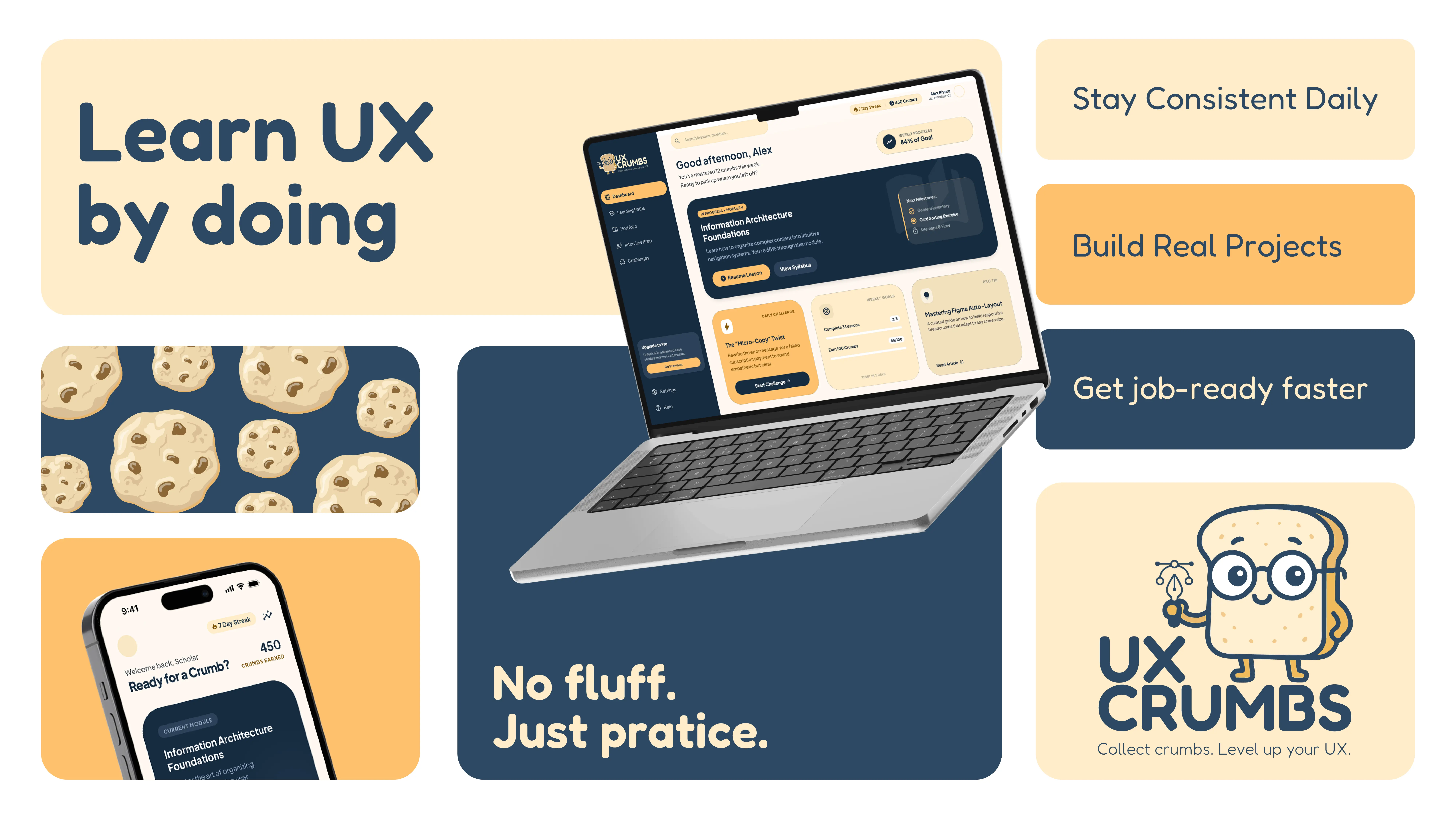


Comments