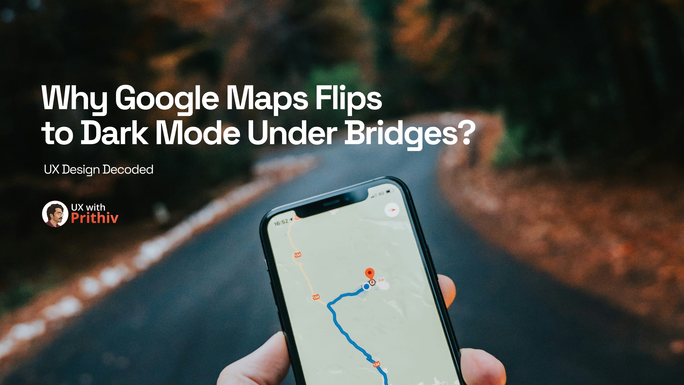
Have you ever noticed your phone screen suddenly switch to dark mode while driving through a tunnel or under a massive bridge? It feels like magic, but it’s actually a brilliant example of Context-Aware Design solving a critical real-world problem.
The Problem: Contrast Shock and Safety
Imagine driving on a bright, sunny day with your navigation set to 100% brightness. Suddenly, you enter a dark tunnel. Your eyes haven't adjusted to the darkness yet, but your screen is still glaring at maximum intensity.
This isn't just annoying; it’s a Safety Hazard. The "Contrast Shock" causes visual fatigue and blinds the driver, momentarily taking their focus off the road.
The Solution: Tunnel Mode
Google Maps uses Environmental Sensors and GPS data to detect these rapid lighting changes in real-time. By instantly triggering "Tunnel Mode," the app matches your physical surroundings.
The UX Lesson for Designers
As designers, we often focus on how an app looks in a controlled environment. But true impact lives in how a product behaves in the "wild." Google Maps solved a major safety issue with a simple color flip.
Key Takeaways:
- Anticipate Environmental Changes: Design for where your user is, not just what they are doing.
- Prioritize Cognitive Load: Reducing "Contrast Shock" ensures the user can process information safely under stress.+1
- Invisible UX is Great UX: The best features are the ones users don't even notice—they just feel like "magic".
The next time you’re designing a feature, ask yourself: Does this adapt to the user's world, or does it force the user to adapt to the screen?


Comments