


Swiggy is a masterclass in operational efficiency and real-time tracking, but from a pure UX perspective, it presents a fascinating case study in the tension between engagement and clarity.
When we audit an app like Swiggy, we have to look past the brand and ask: What is the user actually trying to achieve?
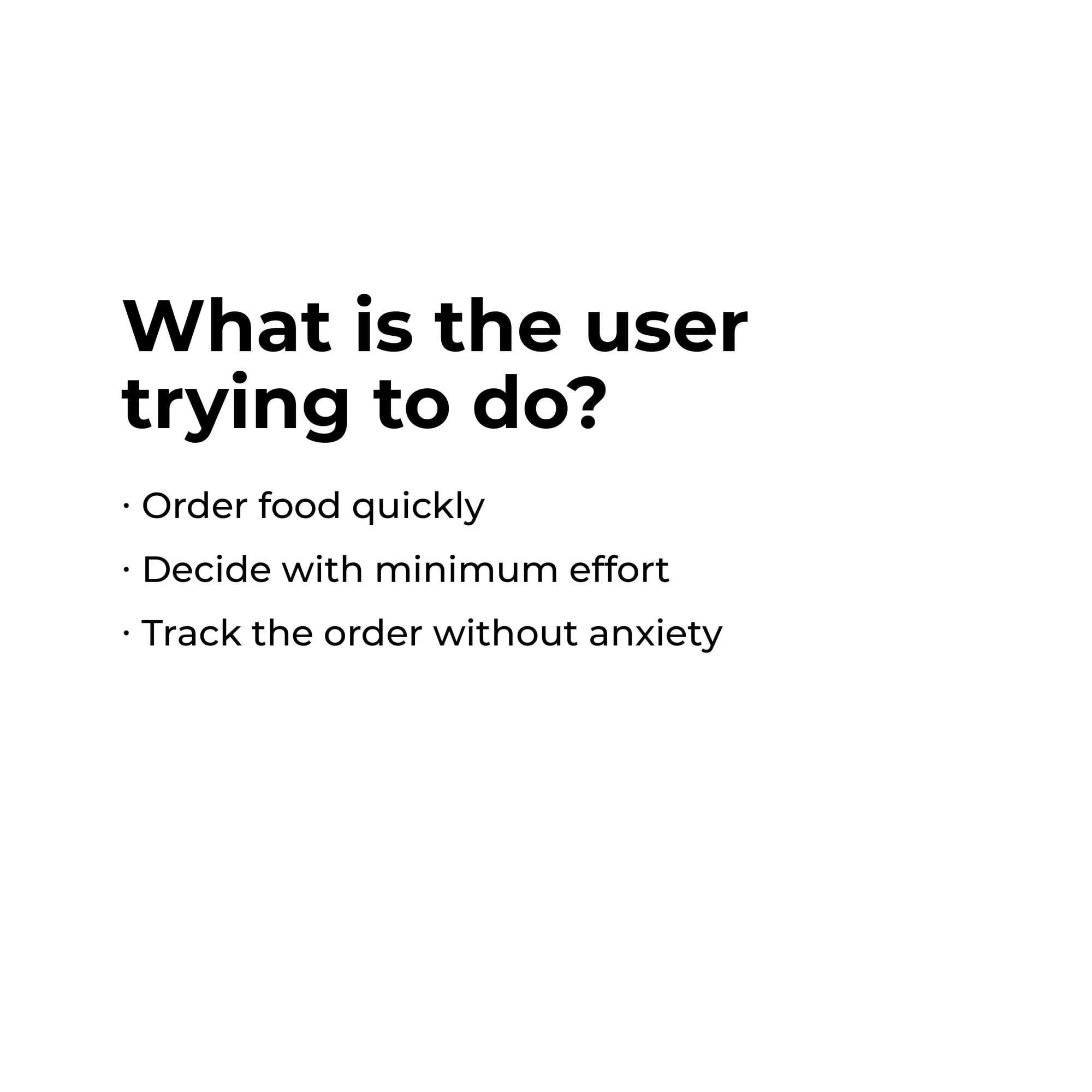
The User Intent
Every time a user opens Swiggy, they have three primary goals:
- Order food quickly.
- Decide with minimum effort.
- Track the order without anxiety.
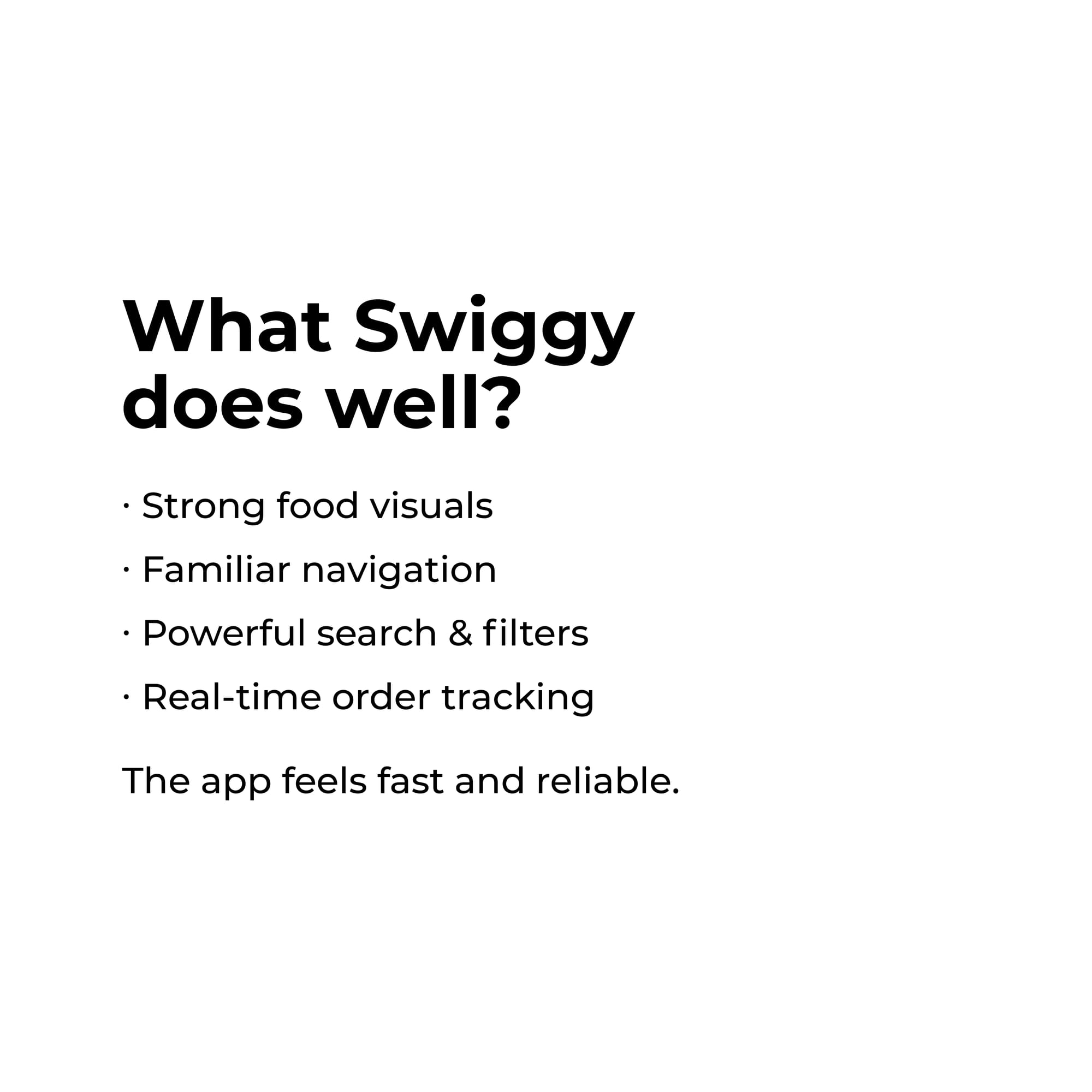
What Swiggy Does Well (The Wins)
Swiggy excels at creating a sense of reliability. The app feels fast, and its core functional pillars are incredibly strong:
- Strong Food Visuals: High-quality imagery that drives appetite and intent.
- Familiar Navigation: Intuitive patterns that make moving through the app feel second nature.
- Powerful Search & Filters: Necessary tools for navigating a massive marketplace.
- Real-time Tracking: Industry-leading order visibility that eliminates user anxiety.
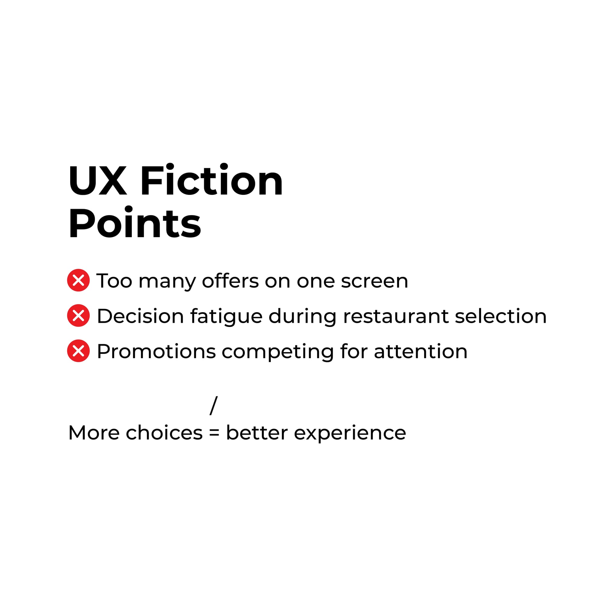
The UX Friction Points (The Trade-offs)
However, success brings complexity. In an effort to maximize engagement and promotions, Swiggy introduces significant "friction points":
- Decision Fatigue: With so many restaurants and cuisines, users often face paralysis.
- Information Overload: Too many offers and promotions competing for attention on a single screen.
- Engagement vs. Clarity: The app often prioritizes keeping you in the interface longer rather than helping you check out faster.
The Verdict: Strategic Trade-off or Mistake?
Good UX reduces doubt. Does Swiggy help users decide faster, or does it make them think longer?.

While a purist might call the cluttered promotion screens a "UX mistake," it is actually a strategic product trade-off. Swiggy optimises for business growth and engagement, even if it occasionally comes at the cost of a "clean" user journey.


Comments