


In the world of product design, a UX audit isn't about judging an app; it’s about understanding the deliberate trade-offs made between business goals and user experience. Today, we’re breaking down one of the most used apps globally: Instagram.
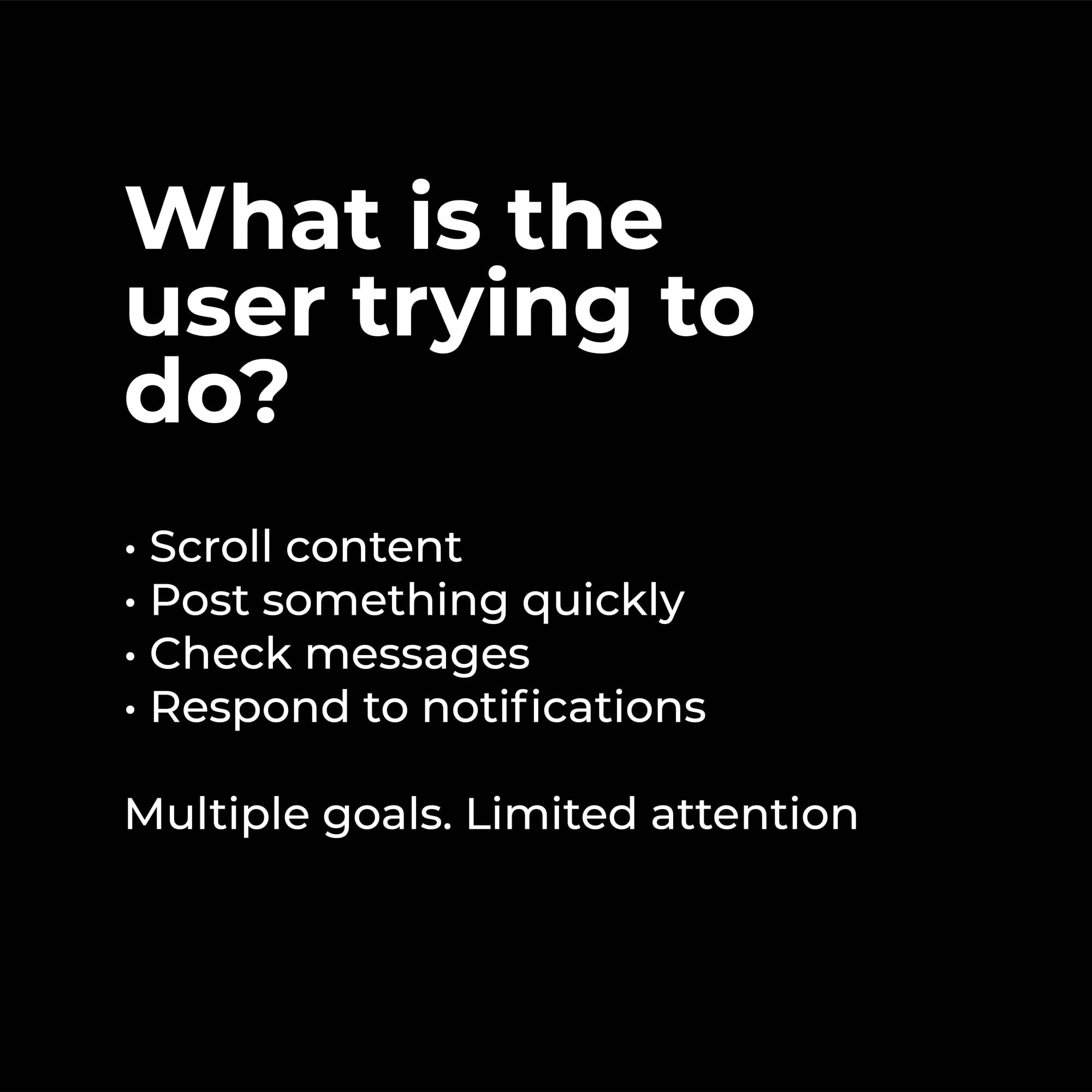
When we audit a platform of this scale, we must first ask: What is the user actually trying to do?. On Instagram, users are often juggling multiple goals with limited attention:
- Scrolling content
- Posting updates quickly
- Checking messages
- Responding to notifications
What Instagram Does Right
Instagram is a masterclass in familiarity. Users rarely feel lost because the app excels in these key areas:
- Familiar Navigation: They lean on industry-standard patterns that require zero learning curve.
- Strong Visual Hierarchy: The app successfully guides the eye to content first.
- Fast Feedback & Smooth Interactions: Every action provides immediate feedback with polished micro-interactions, making the experience feel "alive".
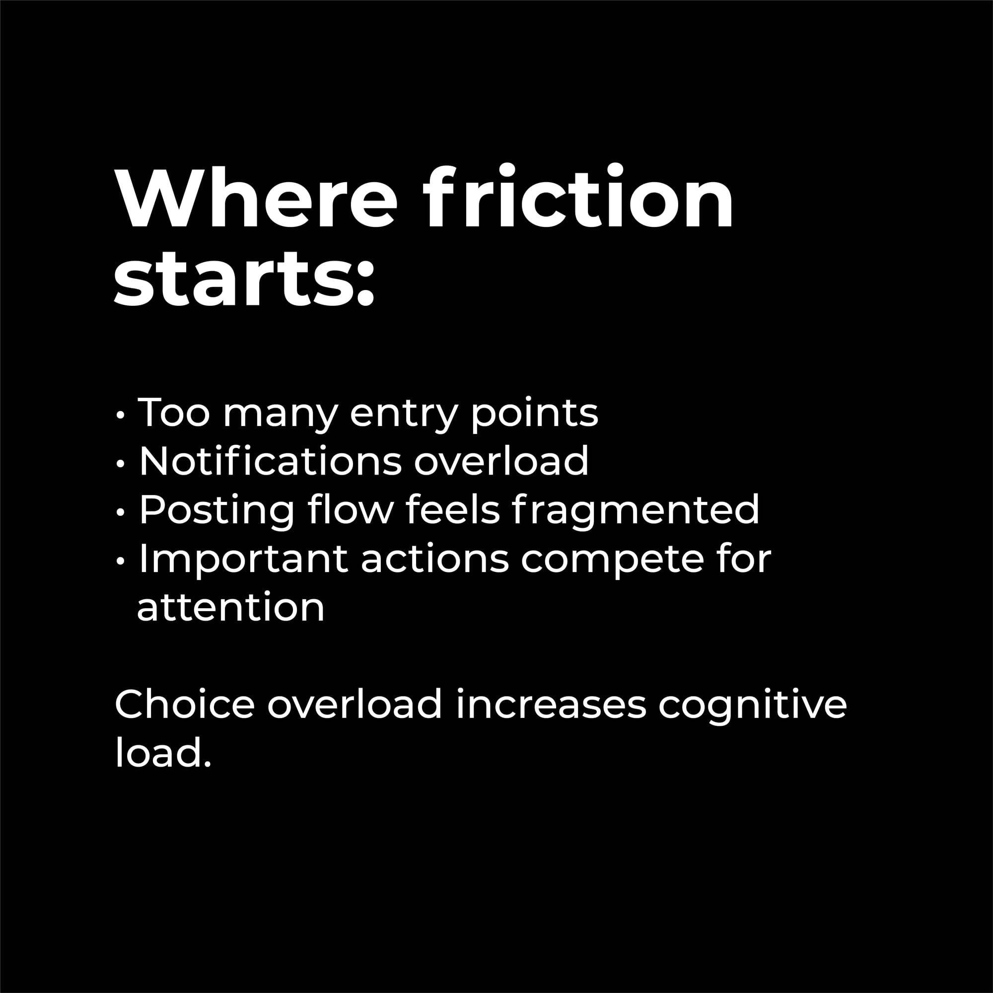
The Friction Points
As apps grow, they often face "choice overload," which significantly increases a user's cognitive load. Friction on Instagram typically starts with:
- Entry Point Overload: Too many ways to start the same task.
- Notification Overload: A constant stream of alerts competing for focus.
- Fragmented Flows: Specifically, the posting flow can feel disconnected from the main experience.
The Core Tension: Engagement vs. Clarity
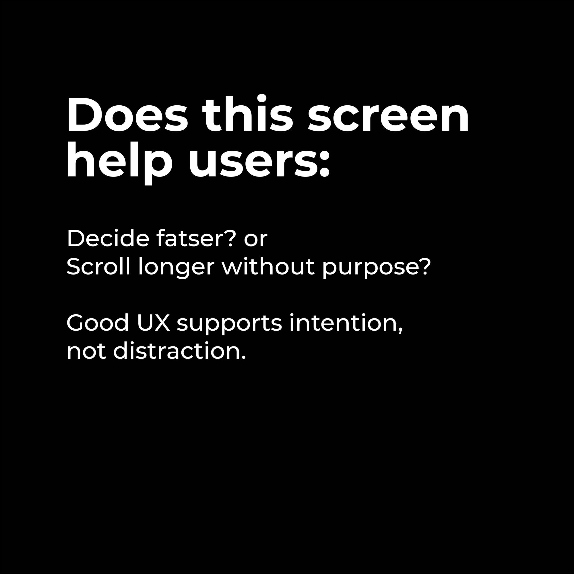
The ultimate question for any screen is: Does this help the user decide faster, or simply scroll longer without purpose?.
Instagram frequently optimises for engagement over clarity. While this is a strategic product decision, it directly impacts the user experience by favoring distraction over intention.
Conclusion
Great UX should support intention. As designers, our job is to recognize when a product is pushing us to stay (engagement) versus helping us finish (clarity). Understanding these trade-offs is what makes a strategic designer.


Comments