The Anatomy of a Perfect Palette: Why Structure Beats Guesswork
In UI design, a beautiful color palette is not a happy accident—it’s a carefully structured system. To ensure accessibility, hierarchy, and visual consistency, every professional color scheme relies on three core roles: Dominant, Secondary, and Accent.
Ignoring this structure leads to visual clutter, confusion, and a design that fails to guide the user. Here is a breakdown of the roles and four complete, proven color combinations that just work.
Understanding the Roles
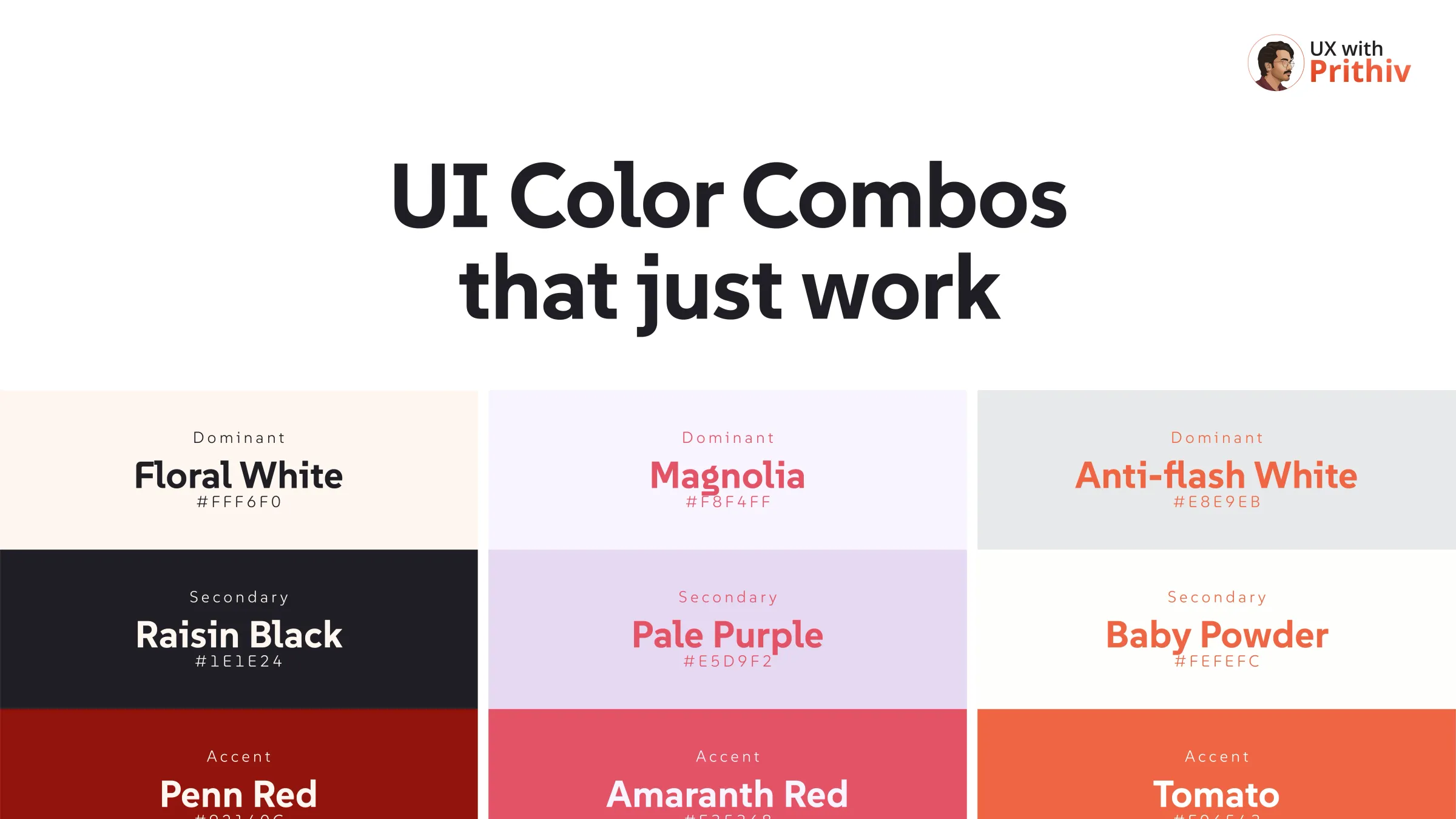
- Dominant Color (The Foundation): This is your main background color, used for the vast majority (often 60-70%) of your interface1. It must be neutral and provide high contrast for text. (Examples: Floral White [#FFF6F0]2, Magnolia [#F8F4FF]3, Seasalt [#F8FBFD]4).
- Secondary Color (The Content): Used for large components, text, navigation, and backgrounds of cards or sidebars (about 20-30% of the UI)5. It provides contrast against the dominant color to define content areas. (Examples: Raisin Black [#1E1E24]6, Pale Purple [#E5D9F2]7, Charcoal [#233D4D]8).
- Accent Color (The Action): The most important color, used sparingly (about 10% of the UI) to draw attention to interactive elements, calls-to-action (CTAs), or key status indicators9. This color drives user behavior. (Examples: Penn Red [#92140C]10, Amaranth Red [#E35368]11, Bright Pink [#EE6C4D]12).
Four UI Color Palettes You Can Use Today
| Role | Color Name | Hex Code | Purpose/Vibe | Source |
| Dominant | Floral White | #FFF6F0 | Clean, airy, minimalist base | |
| Secondary | Raisin Black | #1E1E24 | Provides rich contrast for text | |
| Accent | Penn Red | #92140C | Strong, authoritative action color | |
| Dominant | Magnolia | #F8F4FF | Soft, light purple/grey base | |
| Secondary | Pale Purple | #E5D9F2 | Gentle segmentation of content | |
| Accent | Amaranth Red | #E35368 | Playful, yet clear, call-to-action | |
| Dominant | Beige | #F8F8E1 | Warm, earthy, calming base | |
| Secondary | Non Photo Blue | #8ACCD5 | Cool, contrasting content areas | |
| Accent | Midnight Green | #013A42 | Deep, elegant action color | |
| Dominant | Eggshell | #3B5249 | Deep, rich, forest-like base | |
| Secondary | Cornsilk | #BEC5AD | Soft background for content | |
| Accent | Bright Pink | #EE6C4D | Energetic, vibrant focal point |


Comments