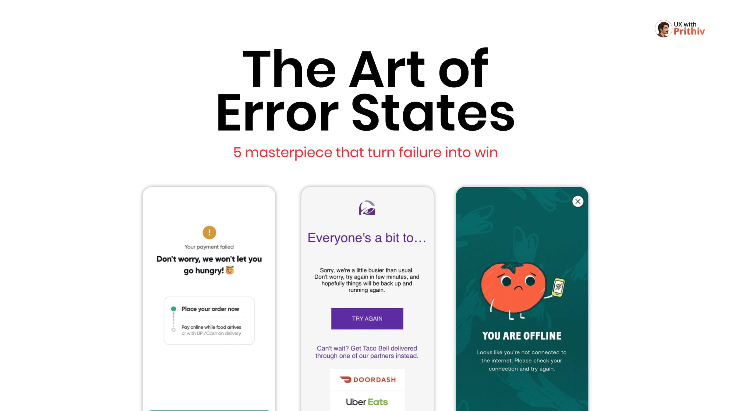
In a perfect world, every user journey would be seamless. But in reality, things go wrong—payments fail, servers get busy, and internet connections drop. In UX design, an error state shouldn't be a dead end; it should be a well-designed bridge back to the "Happy Path."
How a product handles failure defines its character. Here is a teardown of how top apps master the art of error states:
1. Swiggy: Empathy & Humor in Crisis
When a payment fails, the user is often hungry and frustrated.
- The Masterpiece: Swiggy uses a mix of humor and clear next steps.
- The UX Lesson: Their message—"Don't worry, we won't let you go hungry!"—reduces anxiety and provides immediate alternatives like "Pay online while food arrives".
2. Taco Bell: Saving the Sale with Alternatives
Server overloads can lead to lost revenue. Taco Bell turns this technical failure into a partnership opportunity.
- The Masterpiece: When they are "busier than usual," they suggest ordering through partners like DoorDash or Uber Eats.
- The UX Lesson: If you can't solve the problem yourself, guide the user to someone who can.
3. CHOPT: Friendly Offline Experiences
Being offline is a common friction point.
- The Masterpiece: CHOPT uses cute characters and friendly language to make an offline state feel less frustrating.
- The UX Lesson: Visual personality can soften the blow of a technical limitation.
4. IKEA: Turning "Out of Stock" into Opportunity
An empty shelf is usually a point of exit.
- The Masterpiece: IKEA allows users to sign up for push notifications to be alerted when a product is back in stock.
- The UX Lesson: Turn a "No" into a "Not Yet" by providing a clear way for the user to stay connected to the item they want.
5. GoPay: Managing Complex Account Errors
Some errors are pre-requisites for a larger action, like deleting an account.
- The Masterpiece: GoPay uses an organized task list to show exactly what needs to be finished before an account can be closed.
- The UX Lesson: Break down complex errors into a checklist. Clarity reduces the feeling of being "trapped."
Conclusion
Great UX isn't just about what happens when everything works; it's about what happens when everything fails. By designing with empathy, humor, and clear next steps, you can turn a moment of frustration into a moment of loyalty


Comments