


The header, or Hero section, is the single most critical piece of real estate on any website. It’s where you win or lose a user in under 5 seconds. An amazing header doesn't just look good; it acts as a precise conversion machine. It must clearly articulate value, build instant trust, and provide a path forward—all above the fold.
Section 1: The Three Pillars of an Amazing Header
Every successful header, as seen in the examples provided, relies on three core components:
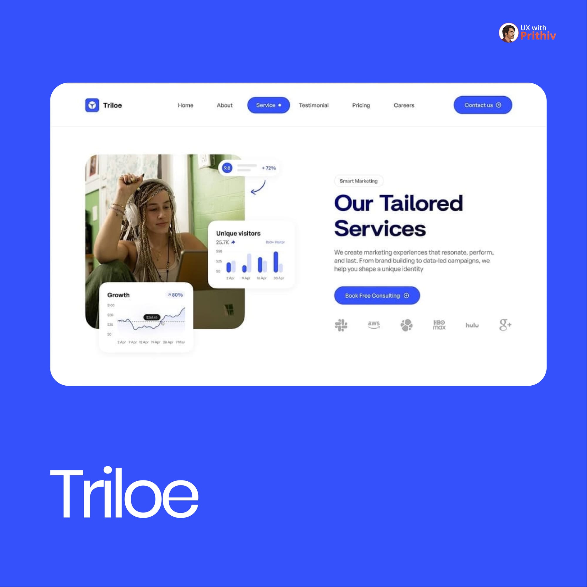
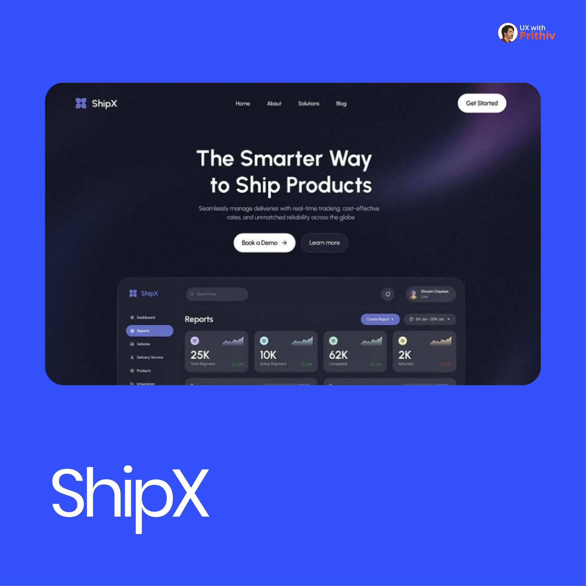
- Irresistible Value Proposition (VP): This is the core benefit, not the feature. For ShipX, it’s “The Smarter Way to Ship Products”. For Skyline, it’s “Discover luxurious international properties... connecting you to top global locations effortlessly”. The user must instantly know what you do and why they need it.
- Clear Call-to-Action (CTA): The CTA must be immediately visible and tell the user exactly what to do next. Examples include "Book a Demo" (ShipX), "Find a house" (Skyline), and "Book Free Consulting" (Trilon).
- Instant Social Proof: Trust must be established immediately. Skyline includes "200K+ Happy users" and a customer testimonial. Sparkly features "Total Learners 120K+" to boost credibility.
Section 2: Mastering the Visual Hierarchy
An Amazing Header guides the user's eye from the Value Proposition straight to the CTA.
- Size & Contrast: The main headline should be the largest element, followed by the CTA, which should use a high-contrast color to stand out from the background and other navigation elements.
- Supportive Imagery: The visual should instantly reinforce the Value Proposition. For Skyline, this would be an image suggesting a luxurious home experience; for ShipX, visuals related to seamless global delivery.
- Dual CTAs: Offering both a soft and a hard CTA (e.g., "Book a Demo" vs. "Learn more" for ShipX) allows users at different stages of the funnel to take action.
Section 3: The Metrics that Matter
For designers, the Header is where visual design meets business goals. The success of your header is not measured in how pretty it is, but in how well it converts.
- Clarity vs. Aesthetics: Always prioritize clarity over aesthetic trends. If your Value Prop is confusing, no amount of polish will save your conversion rate.
- Key Performance Indicators (KPIs): The amazing header must be optimized for key metrics like Time-to-Value, Activation Rate, and Conversion Rate. The moment a user lands, they should be seconds away from realizing your product's core benefit.


Comments