


A landing page isn't just a static web page; it's a meticulously crafted conversion funnel. The perfect landing page anticipates user doubt, validates their pain, and clearly presents the solution, all while driving a single, unmistakable action. The key is to follow a predictable structure that aligns with the user's psychological journey from curiosity to commitment.
Here is the 7-step blueprint for designing a high-converting landing page
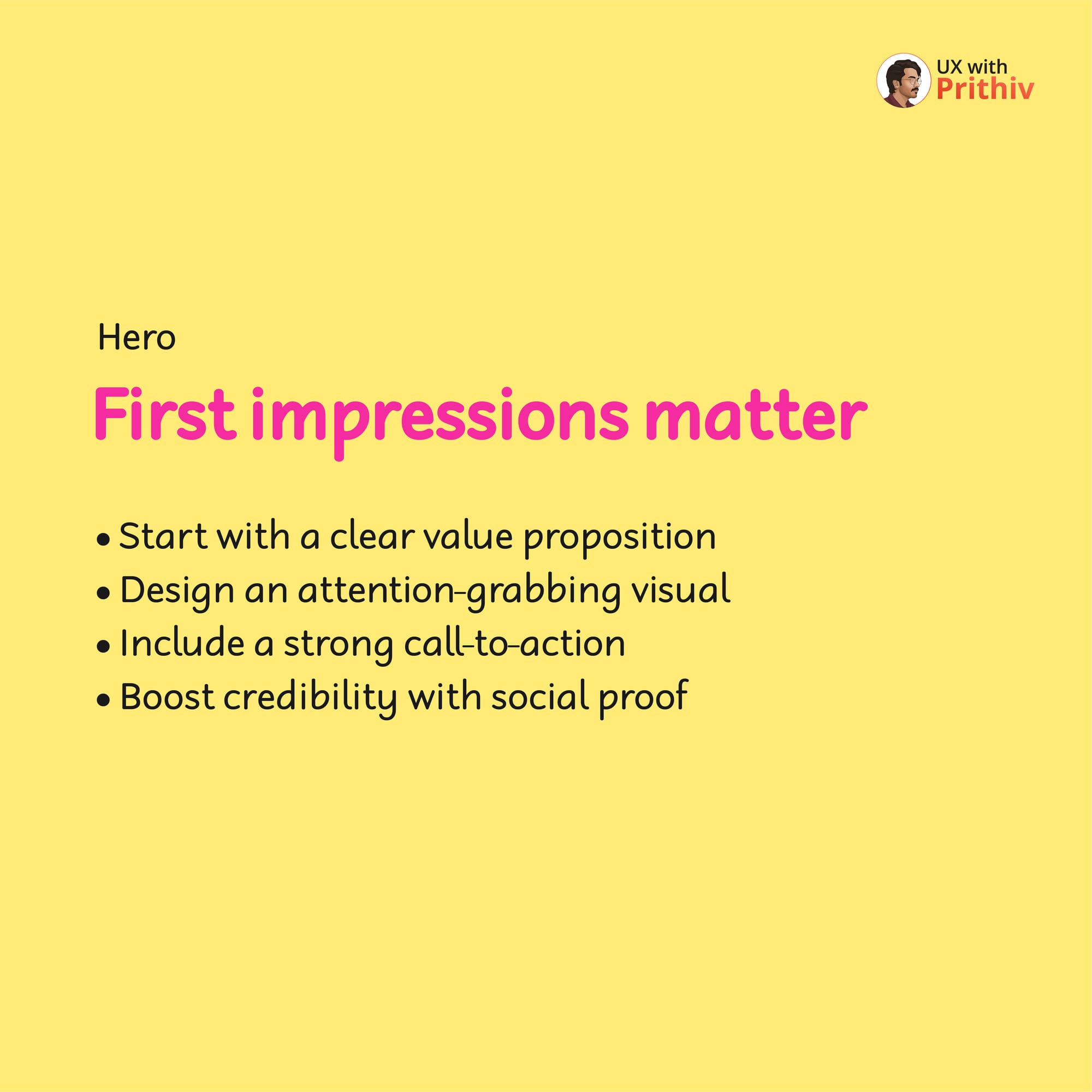
Step 1: The Hero Section (First Impressions Matter)
Your hero section must hook the user instantly.
- Value Proposition: Start with a clear value proposition.
- Visuals & CTA: Design an attention-grabbing visual and include a strong Call-to-Action (CTA).
- Credibility: Boost credibility immediately with social proof.
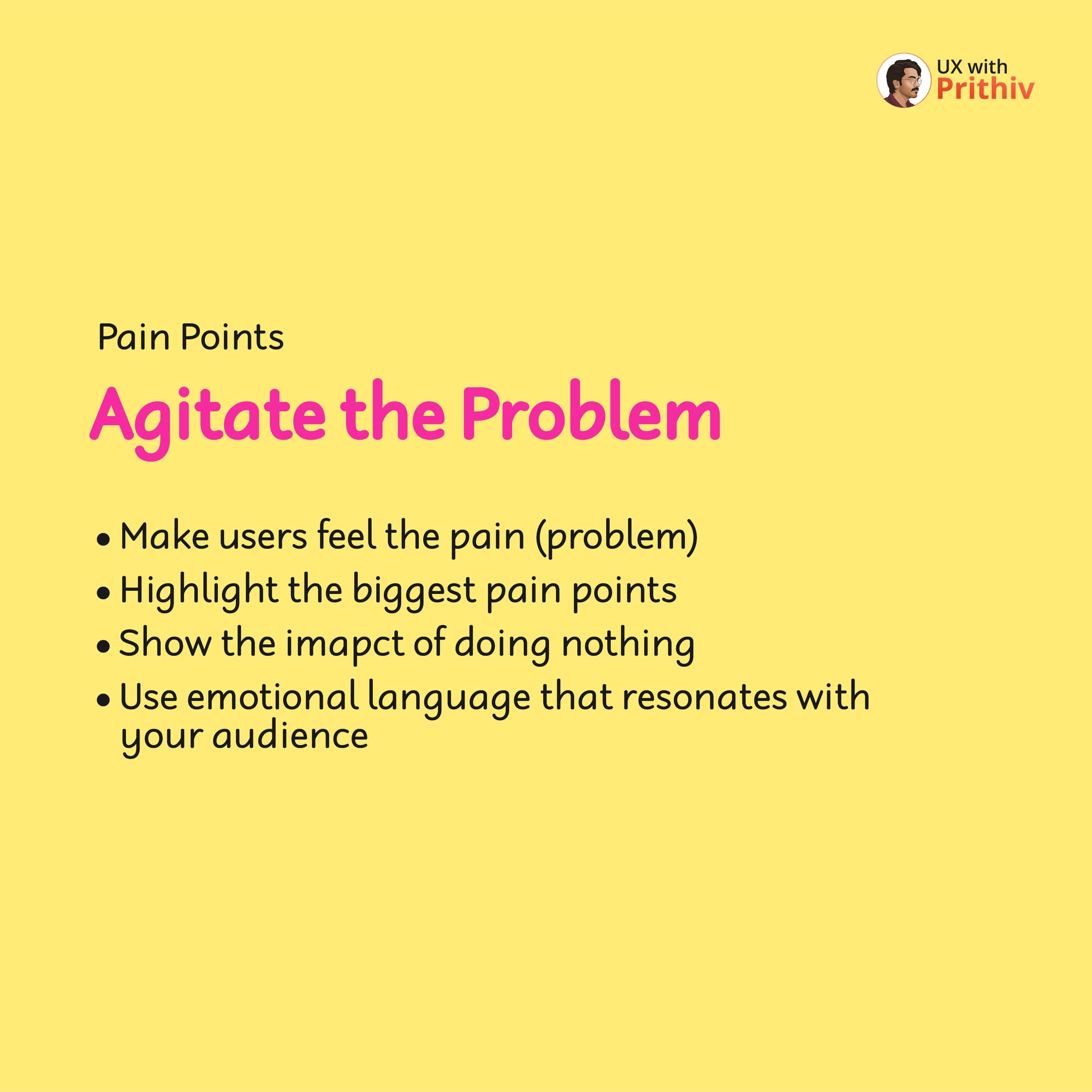
Step 2: Agitate the Problem (Pain Points)
Before presenting the solution, make the user feel the problem they came to solve.
- Highlight the Pain: Make users feel the pain of their current situation by highlighting their biggest pain points.
- Consequences: Show the impact of doing nothing and use emotional language that resonates with your audience.
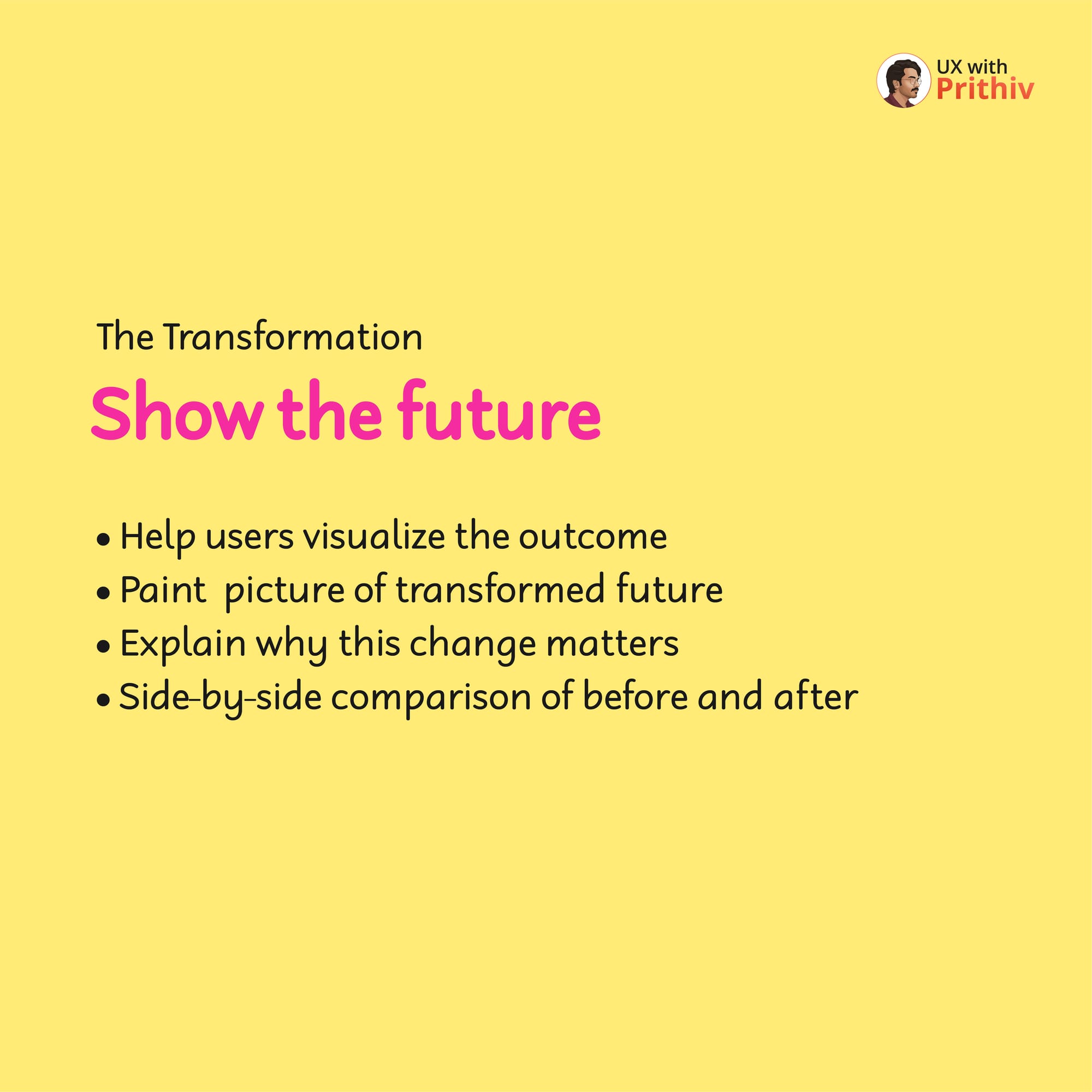
Step 3: Show the Transformation
Once the user feels the pain, you must present the desired future state—the transformation.
- Visualize the Outcome: Help users visualize the outcome and paint a picture of their transformed future.
- Explain Why: Explain why this change matters and use side-by-side comparisons of before and after.
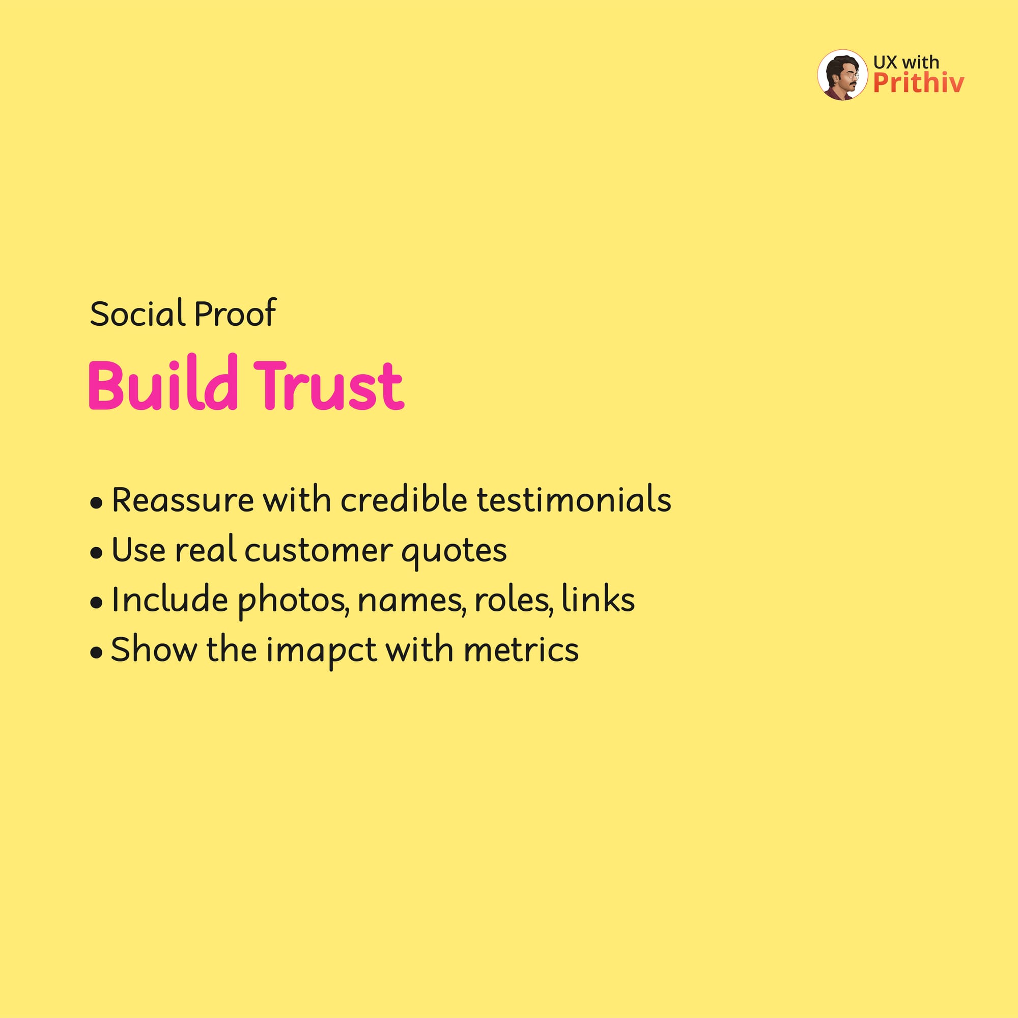
Step 4: Build Trust (Social Proof)
Social proof removes risk and builds confidence.
- Credibility: Reassure users with credible testimonials and use real customer quotes.
- Detail: Include photos, names, roles, and links for authenticity, and show the impact with metrics.
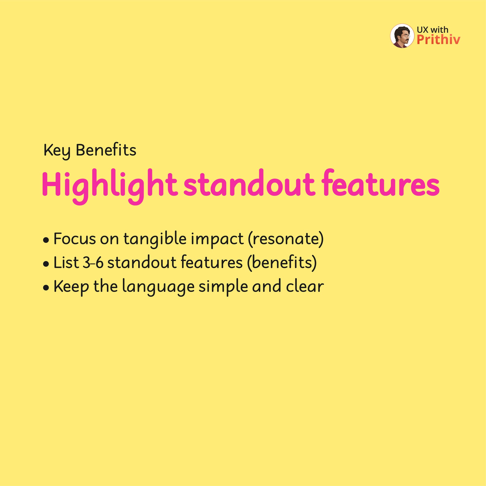
Step 5: Highlight Key Benefits
Focus on the tangible impact of your standout features.
- Focus on Impact: Focus on the tangible impact that resonates with the user.
- List Clearly: List 3-6 standout features (benefits) and keep the language simple and clear.
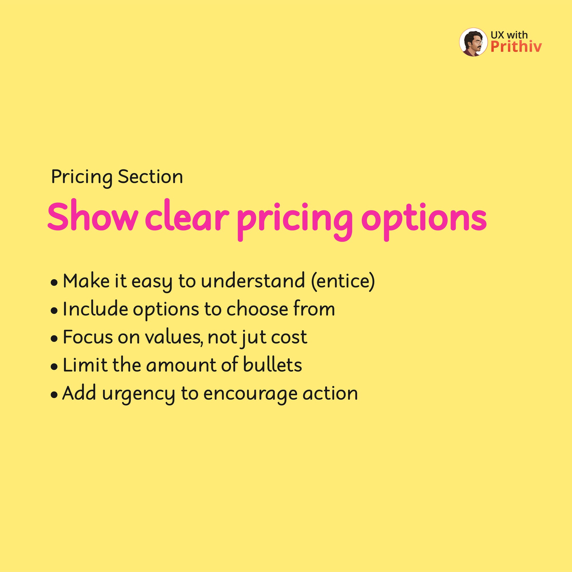
Step 6: The Pricing Section (Focus on Value)
Your pricing section must be easy to understand and address doubts.
- Clarity: Show clear pricing options and focus on values, not just cost. Include options to choose from and add urgency to encourage action.
- Address Doubts: Handle potential objections, cover common concerns (like pricing, features, or refund policies), be honest, and don't overpromise.
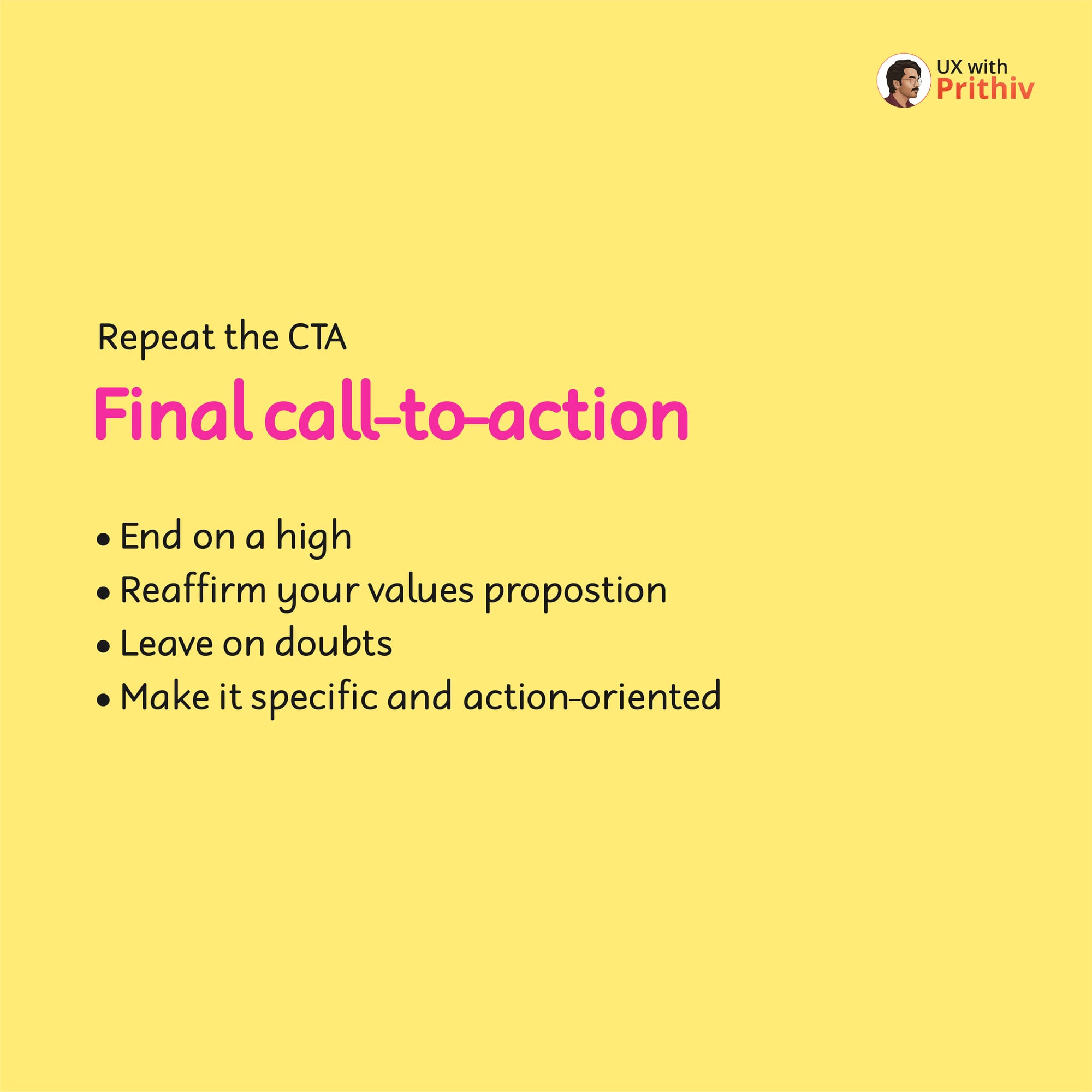
Step 7: Repeat the CTA (Final Call-to-Action)
End on a high note by repeating your primary CTA.
- Final Push: Reaffirm your value proposition, leave no doubts, and make the CTA specific and action-oriented.


Comments