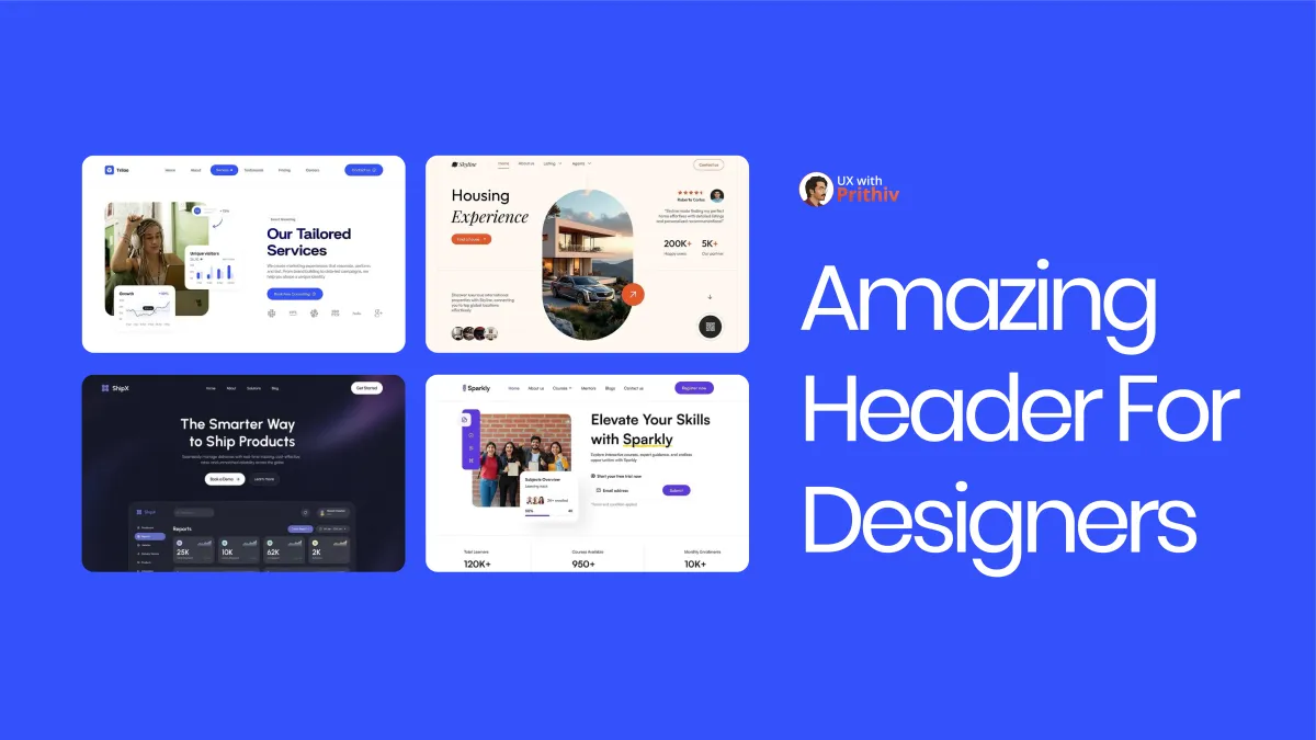
The Amazing Header Blueprint: 3 Seconds to Success.
A high-converting header must contain three elements: Irresistible Value Prop, a Clear CTA (e.g., "Book a Demo"), and Instant Social Proof (e.g., "200K+ Happy users").

A high-converting header must contain three elements: Irresistible Value Prop, a Clear CTA (e.g., "Book a Demo"), and Instant Social Proof (e.g., "200K+ Happy users").
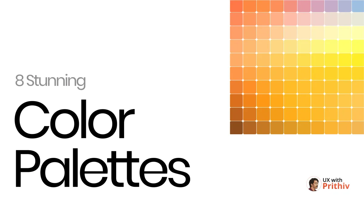
Color drives emotion and hierarchy. Go beyond defaults with curated palettes like Aqua (trustworthy), Ice Cream (playful), and Earth (organic). Includes hex codes.
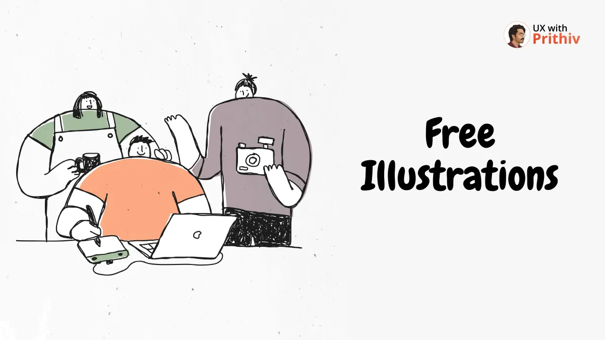
Use GetIllustrations.com (vectors), DrawKit.com (2D/3D), and Blush.design (customization) to add high-quality, royalty-free visuals to your UX projects.
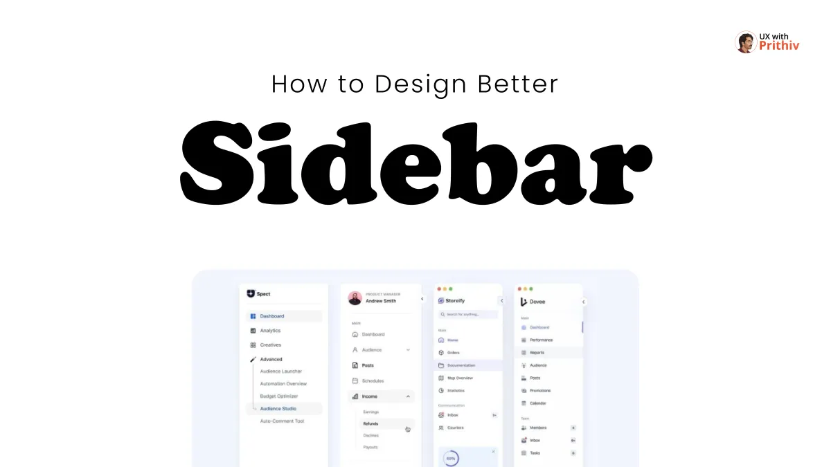
Structure is key! A great sidebar needs: Clear Main Navigation Dedicated CTA Section (e.g., Upgrade) Consistent Spacing (e.g., 40px+ link height).
Tools like Vercel v0, Lovable, and Bolt translate design concepts into functional code using natural language or Figma imports.
Mobile UI Spacing is key! 📐 Use this system for clarity: Side Margins: 4px - 16px. Title/Content: 12px - 16px. Buttons: 12px - 16px vertical padding for 44-52px click height.


Stop redesigning! Study the masters: Design System Libraries are the blueprint for scale.

Master the core parts of components like the Toast Notification (Icon + Title) and Checkbox (Container + Label) to build intuitive, flawless products.

The secret to scalable design? Use a minimal set of magic frame sizes! Mobile: 360px (Android) / 375px (iOS) wide. Tablet: 744 x 1133 px. Desktop: 1440px wide.
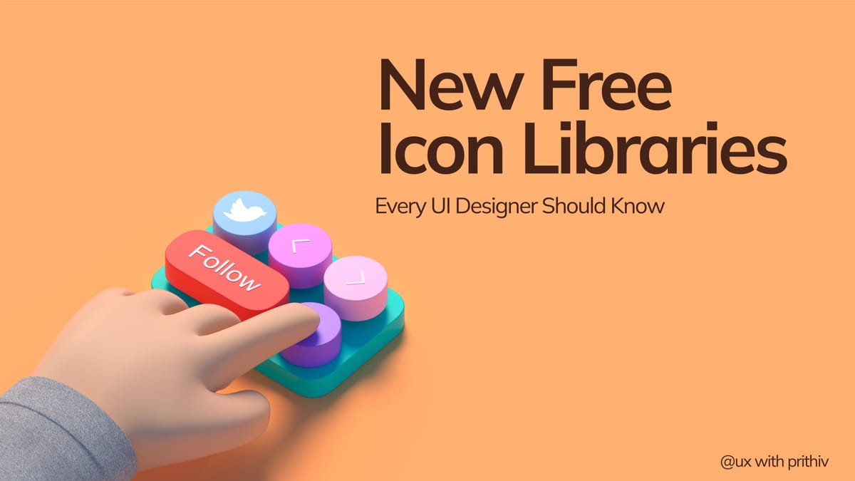
Stop drawing icons! 🎨 A great UI needs consistent, high-quality icon sets.

Buttons are key to user interaction. Understanding the 8 most common types—like Primary, Secondary, and Floating Action Buttons—is essential for creating clear and effective digital interfaces. Mastering these helps you guide users seamlessly through any product.
