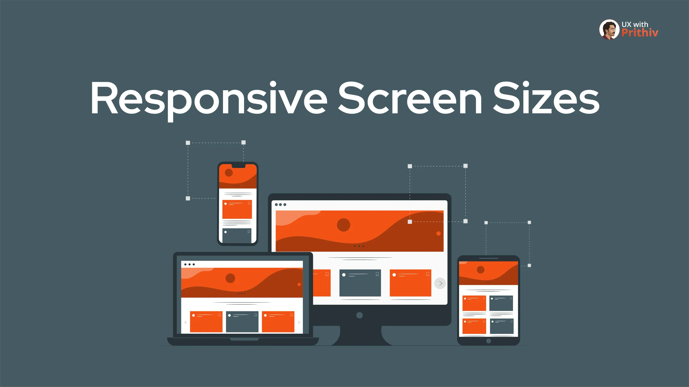
In today's multi-device world, designing for a single screen size is a recipe for failure. Effective UX design means ensuring a seamless, consistent experience across all devices, from the smallest phone to the largest monitor. This requires a strong understanding of responsive breakpoints—the specific screen widths where your layout and styling must adapt.
Mastering these five screen size ranges is fundamental to creating truly responsive and accessible products.
The 5 Key Responsive Breakpoints
These pixel ranges represent the standard breakpoints for adapting your design structure, spacing, and content flow.
1. Mobile Portrait
- Range: 320px to 479px
- The Focus: This is the smallest screen size and is critical for touch-friendly UX. Designers must prioritize content hierarchy and large, easy-to-tap interaction areas.
2. Mobile Landscape
- Range: 481px to 767px
- The Focus: When a phone is turned sideways, the design shifts to landscape. This added horizontal space can be used for slight structural changes, but the mobile-first constraints still apply.
3. Tablet Portrait
- Range: 768px to 1024px
- The Focus: This is the first major opportunity to introduce multi-column layouts and more complex information structures. You can utilize the extra space for improved navigation and sidebars.
4. Tablet Landscape
- Range: 1024px to 768px
- The Focus: Designing for this range requires ensuring the layout remains functional and readable when the tablet is held horizontally. It provides near-desktop width for components.
5. Laptop/Desktop
- Range: 1025px to 1280px
- The Focus: This is the traditional desktop design view where content density increases. Here, you finalize features like complex menus, full navigation bars, and data-heavy dashboards.
Why These Ranges Matter
Understanding these exact pixel ranges helps designers and developers speak the same language. These ranges directly translate to the CSS media queries used in development, making the handoff process seamless. By designing intentionally for each bracket, you ensure the user's experience is optimized regardless of the device they use.


Comments