


In mobile design, space is precious. The difference between a sleek, professional app and a cluttered, confusing one often comes down to one thing: consistent and thoughtful spacing.
Spacing is the silent language of hierarchy and usability. It dictates what elements belong together and guides the user's eye, ensuring a seamless experience on small screens. Here is a breakdown of the key spacing rules (in pixels) that create highly usable mobile interfaces:
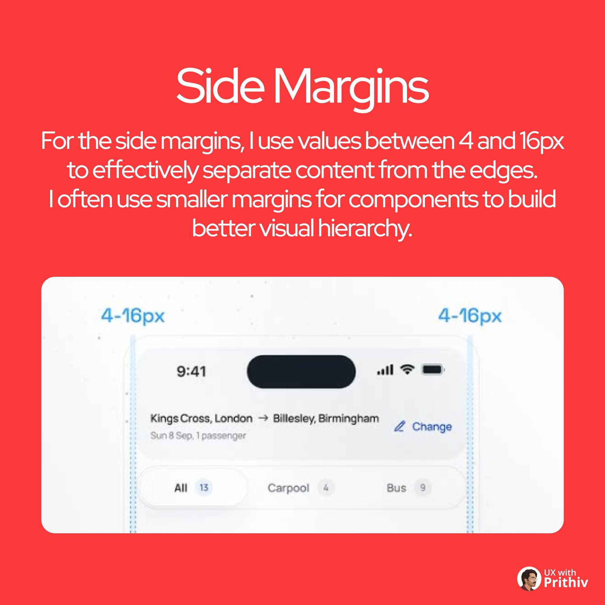
1. Side Margins (The Edges)
Side margins establish the safe zone, preventing content from touching the screen edges.
- Rule: Use values between 4px and 16px.
- Best Practice: Utilize smaller margins (e.g., 4px or 8px) for isolated components (like tabs or chips) to create visual hierarchy, and larger margins (12px or 16px) for the main content block to ensure separation from the edge.
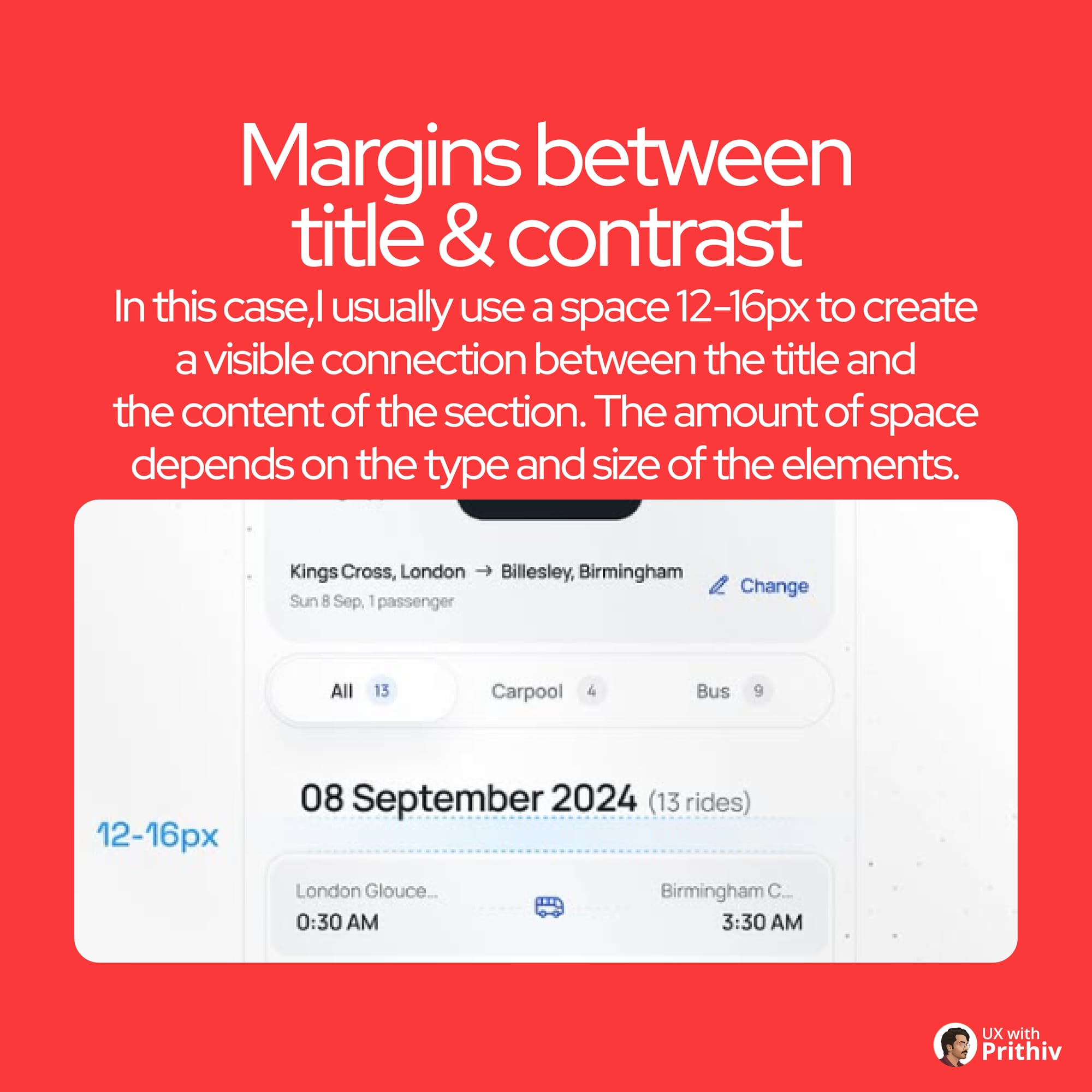
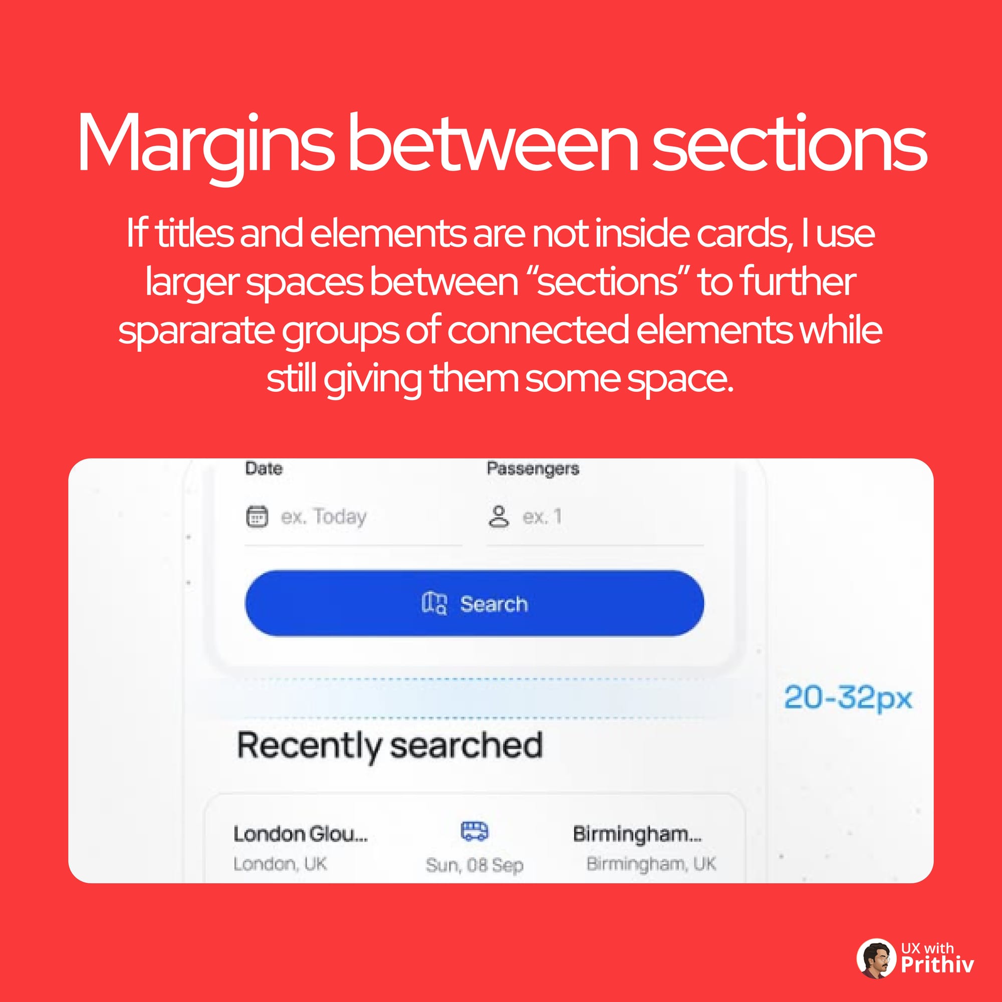
2. Margins Between Title & Content (The Connection)
This spacing is crucial for connecting a section header (title) to the relevant content below it.
- Rule: Typically use 12px to 16px of space.
- Best Practice: This size creates a visible connection, communicating that the title belongs to the section while providing enough air to prevent clutter.
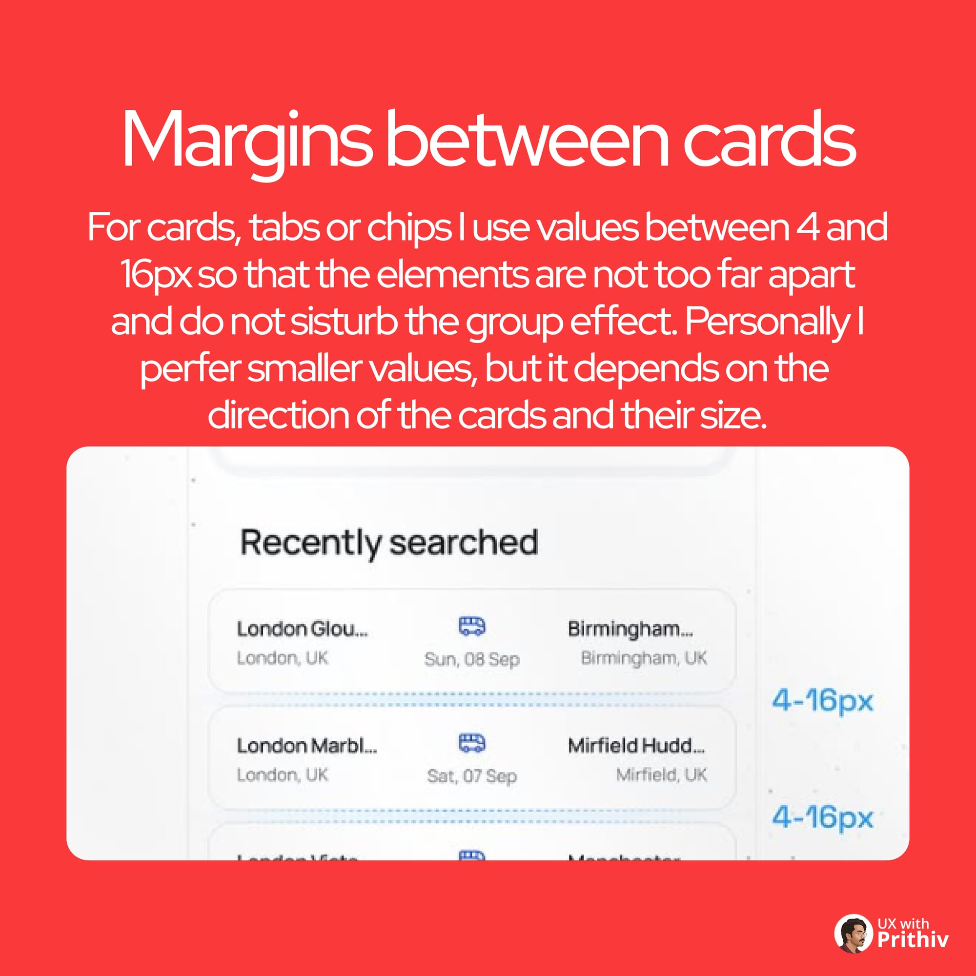
3. Margins Between Cards/Chips (The Grouping)
For separating related, but distinct, pieces of information (like cards or tabs).
- Rule: Use values between 4px and 16px.
- Best Practice: The goal is to keep them close enough to imply grouping, but far enough apart to prevent the confusion that they are a single element. Smaller values (4px-8px) for closely related chips, larger values (12px-16px) for major cards.
4. Paddings Inside Buttons (The Click Target)
Buttons must be easy to hit. Padding ensures the tap target is large enough for comfort, especially on Android (min 48dp) and iOS (min 44pt).
- Icon/Label: Use 6px to 8px between the icon and the text.
- Top/Bottom Padding: Add 12px to 16px to ensure the button reaches the minimum height of 44px to 52px.
- Side Padding: Proportionally larger (e.g., 16px to 24px) for visual balance.
5. Padding Inside Tab Bar (The Navigation Anchor)
The bottom tab bar requires careful padding to remain functional and visually stable, especially near the iOS home indicator.
- Rule: Use smaller spaces between the icon and label for connection, and larger overall padding for clickability and to camouflage the space above the iOS indicator.
Mastering this system is critical to building beautiful, functional, and scalable mobile UIs.


Comments