


The login screen is the final gatekeeper before a user engages with your product. A confusing, complex, or frustrating login experience is one of the fastest ways to lose a user. Your goal is to make this screen a welcoming pathway, not a roadblock. This article breaks down the essential rules for designing a clean, consistent, and user-friendly login experience.
Rule 1: Always Offer Alternative Sign-In Options
Users have different preferences and sometimes prioritize speed or privacy. Don't force them into a single, high-friction path.
- The Best Practice: Always show alternative sign-in options, such as Sign in with Google or Apple, alongside the traditional email/password option.
- The Benefit: This immediately reduces cognitive load and allows users to leverage existing, trusted accounts, making the process faster and more convenient. This aligns with building a truly user-friendly login.
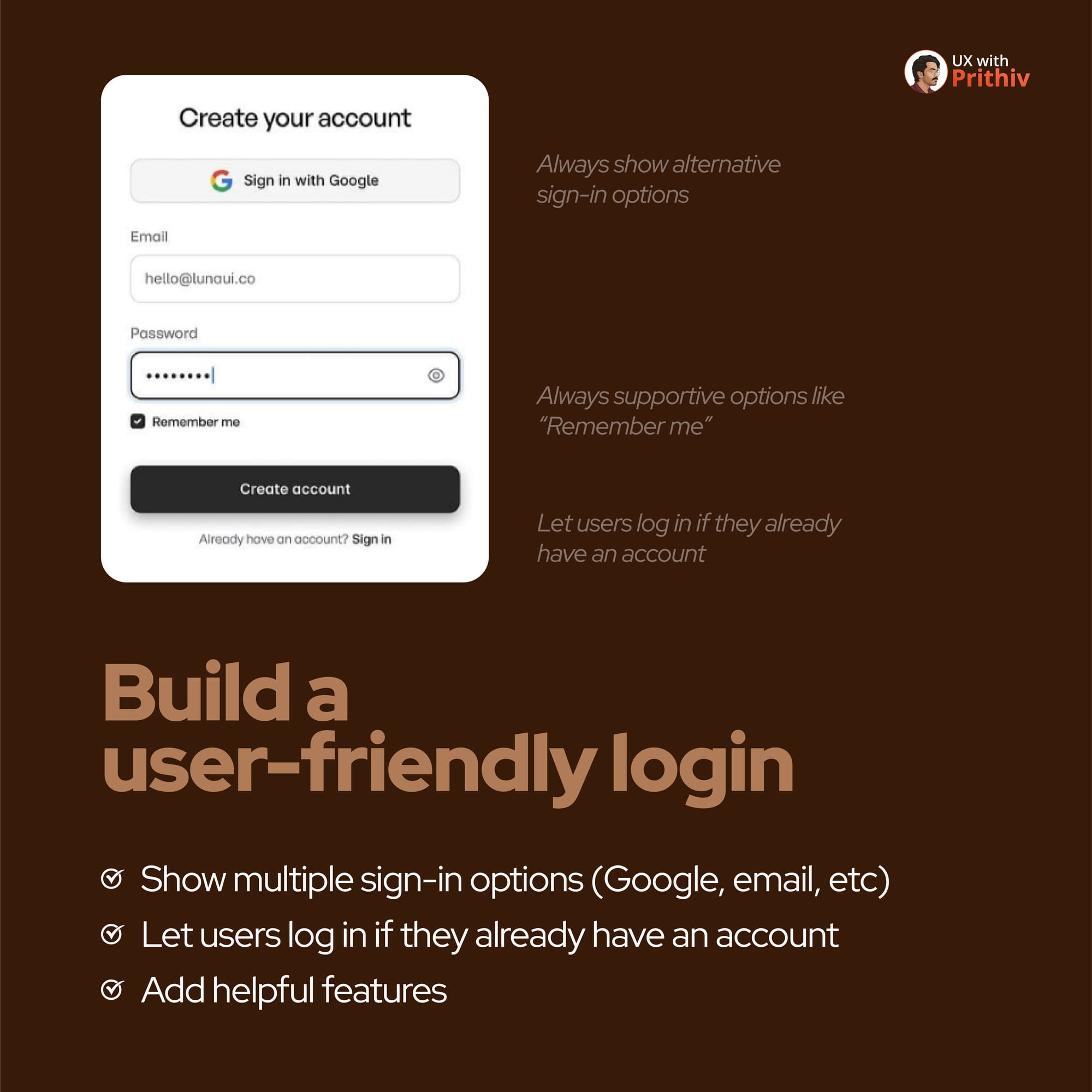
Rule 2: Build a Supportive and Intuitive Flow
A well-designed login screen anticipates common user needs and provides immediate solutions.
- Helpful Features: Always include supportive options like "Remember me" to save users time on repeat visits.
- Prevent Roadblocks: For a signup flow, clearly let users log in if they already have an account. This prevents unnecessary friction, confusion, or the creation of duplicate accounts.

Rule 3: Define a Clean and Consistent Layout
Clutter and inconsistent spacing make a form look complicated and overwhelming. Simplicity and consistency are key.
- Field Spacing: Use consistent, generous spacing between form elements, specifically 16-32px. This allows the user's eye to easily scan and process the information.
- Visual Balance: If you include a side image, maintain a clear separation from the form by keeping 64-80px between the form and the image.
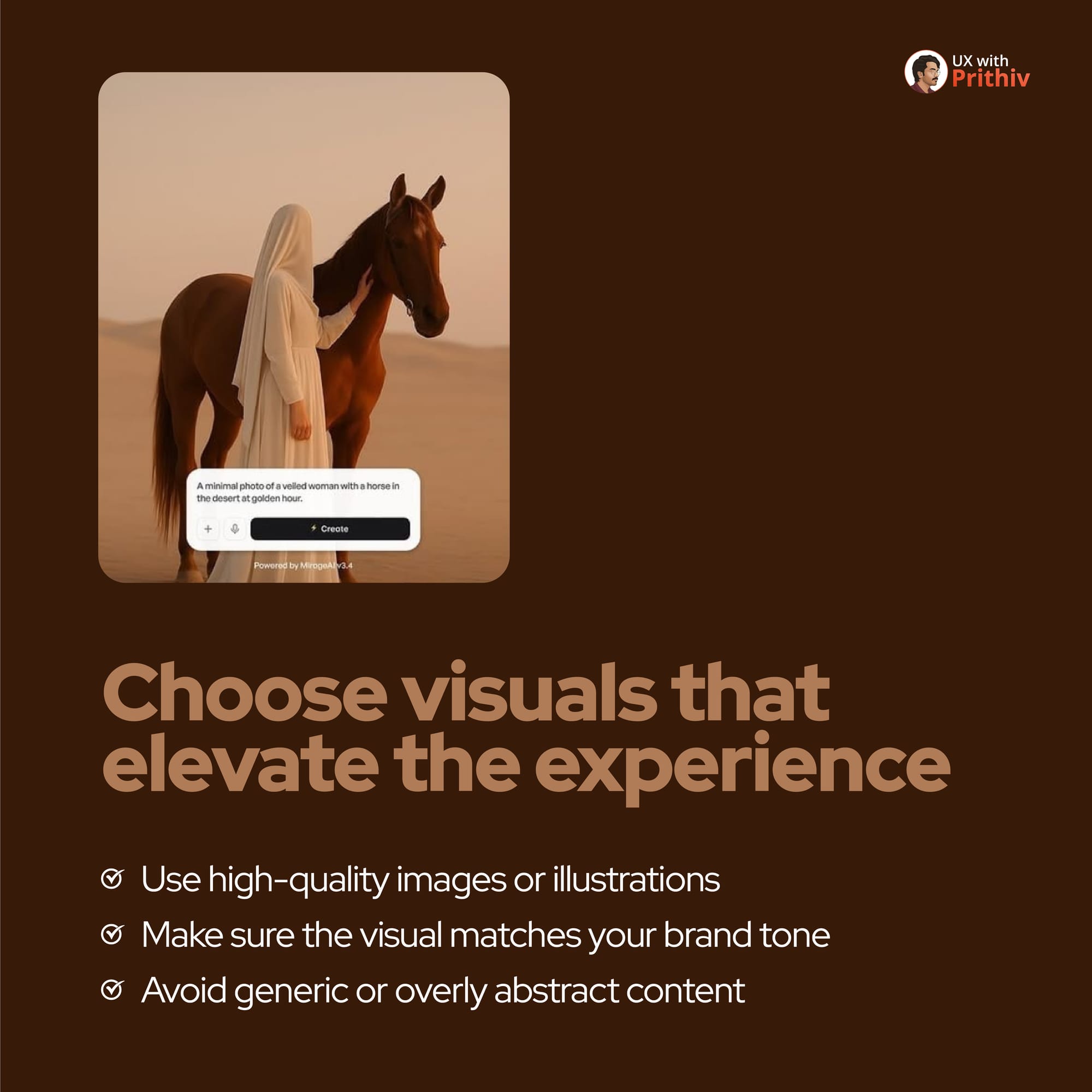
Rule 4: Choose Visuals that Elevate the Experience
The image or illustration on your login screen isn't just decoration—it’s a powerful tool to set the mood and reinforce your brand.
- Quality First: Use high-quality images or illustrations that look professional and intentional.
- Brand Match: Make sure the visual specifically matches your brand tone. For example, use a serene photo for a wellness app or a vibrant illustration for a creative tool.
- Avoid: Avoid generic or overly abstract content that fails to add value or context.
By implementing these best rules, you can transform a necessary chore (logging in) into a smooth, positive, and brand-aligned start for every user.


Comments