From a Frustrating Legacy Automotive Platform into a Modern Technician’s Ally
A deep dive into the UX journey behind a critical tool used by hundreds of automotive technicians daily — revealing insights on overcoming complex challenges with human-centered design.
The Spark
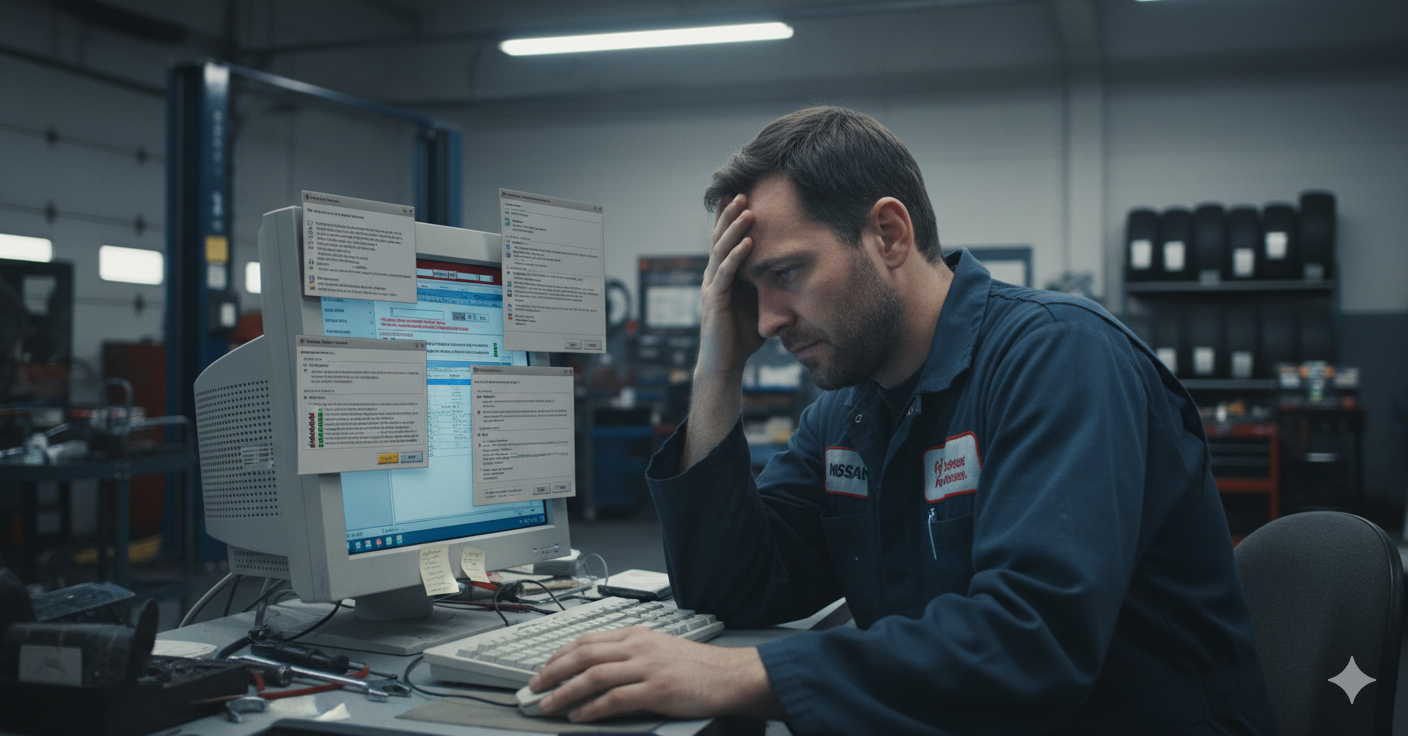
Frustration Holding Skilled Technicians Back
Technicians are masters of their craft, but their primary software tool was holding them hostage. Imagine needing to quickly diagnose and repair a vehicle, yet the platform you rely upon is:
- Slow and fragmented across multiple disconnected systems
- Requiring multiple frustrating logins throughout the day
- Offering a search function that often yields irrelevant or no results
- Forcing you to juggle PDFs, web browsers, and standalone apps continuously
“I knew how to fix the problem, but I couldn’t find the info fast enough,” shared a senior technician with 20+ years of experience.

The call was clear: this legacy platform needed a radical user experience overhaul to enable technicians to focus on doing what they do best—fix cars efficiently and confidently.
Listening to the Experts
Research That Revealed Hidden Pain
Our first priority was to understand every nuance of the problem from those who knew it best—the technicians on the ground. We conducted:
- In-depth interviews with technicians spanning 10 to 34 years’ experience
- Detailed journey mapping of their daily workflows
- Analysis of challenges tied to login friction, broken searches, and scattered resources
Common pain points included
- Repeated logins disrupting flow
- Ineffective keyword and VIN-based search with poor relevance
- Cumbersome toggling between text-heavy PDFs and browser tabs
- Inefficient manual note-taking and documentation
“Switching between five tabs and printing pages just to pin down one fix—that’s not helping anyone.”

Ideation & Prototyping
Designing with Empathy and Precision
Armed with raw insights, we sketched multiple navigation models to reimagine the experience:
- Improved search across documentation types for quick category switching
- A dashboard based approach showcasing frequently used functions and updates
- More intuitive layouts for multitasking enabling viewing manuals and wiring diagrams side-by-side
Each prototype was tested with real technicians, fuelling iterations and shedding light on what truly worked.
Key discoveries
- Centralised search bar that accepts VINs, keywords, and error codes drastically improved find-ability.
- Persistent navigation reduced cognitive overload and eliminated endless clicking.
- Interactive features (such as annotatable diagrams) empowered technicians to visualise and document efficiently.
Crafting the Final Experience
Seamless, Powerful, and Intuitive
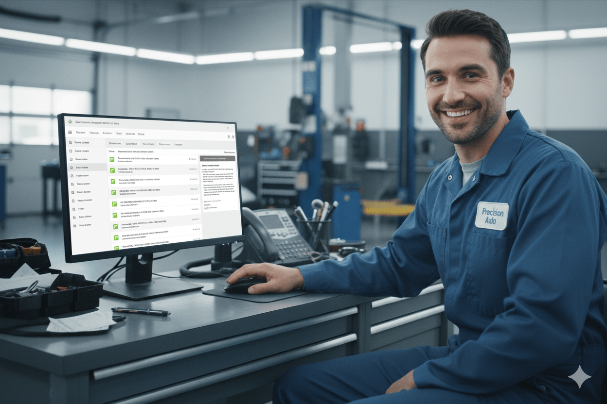
The final design revolutionised how technicians access and interact with information:
- Single Sign-On gave seamless entry to all resources, eliminating repetitive logins.
- Unified smart search returned instant, relevant results—no matter if bulletins, manuals, or campaigns.
- Personalised dashboard surfaced “What’s New,” recent searches, and bookmarked content at a glance
- Interactive diagrams and manuals allowed direct annotations, boosting clarity and collaboration
- Fully responsive, accessible, and localised to meet techs where they work best
Results That Speak
From Lost Time to Empowered Problem Solvers
The impact was measurable and meaningful:
- Internal metrics showed substantial reduction in research and repair diagnosis time
- Significant reduction in support tickets related to navigation and search
- Positive user sentiment:
“It feels like a tool made for me—not against me.” “I’m actually excited to use this every day now.”
This was not just a facelift; it was a transformation that elevated technicians’ confidence and efficiency while laying a foundation for future AI-driven enhancements.

Lessons Learned
The Power of Human-Centered UX in Complex Systems
- Start with deep empathy; listen beyond surface complaints
- Validate ideas early and often with real users
- Simplify complex workflows by unifying scattered resources
- Build for the future by creating modular, extensible designs
- Remember: great design frees users to do what they do best
Final Thoughts
This project was a testament to the transformative power of UX when it’s rooted in real human needs. By turning frustration into flow, we didn’t just redesign a tool—we reignited passion, pride, and productivity for technicians who keep millions of vehicles on the road.
Want to see the full process or discuss how we can transform your legacy tools into user-centric powerhouses? Reach out anytime!
Have a question or idea? Click below to connect with me directly.


