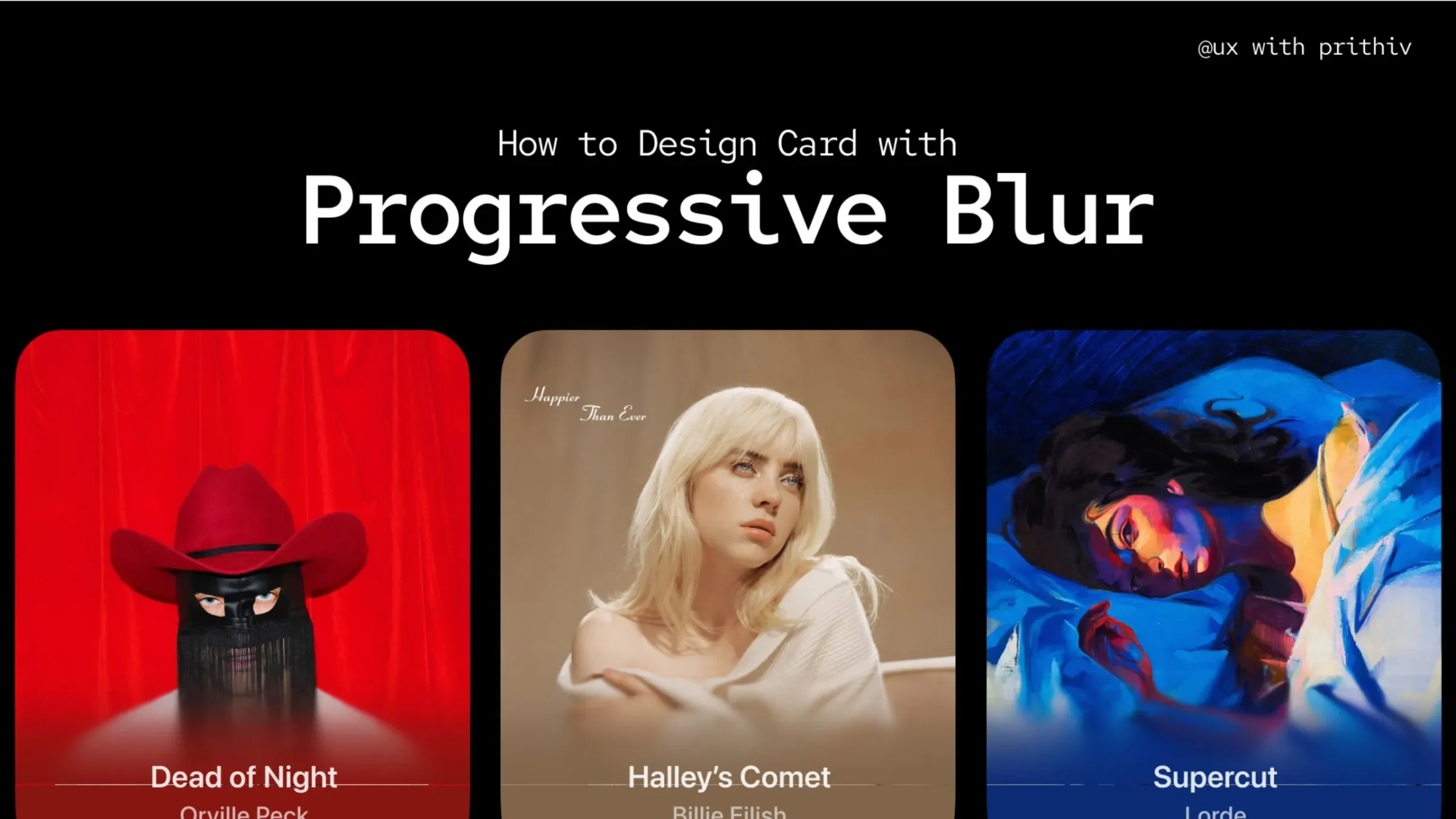
The Progressive Blur technique is the core component of modern Glassmorphism and frosted-glass effects. It's subtle, smart, and creates a focused viewing area for the content.
Step 1: Create and Style the Base Frame
Start by setting up the foundation of your card. This frame will house the background image and the blurred element.
- Action: Press
Fto create a new frame (e.g.,320 x 440). - Aesthetics: Apply your background image or fill. Crucially, add a subtle Drop Shadow to give the card initial lift.
- Example Shadow: Blur
0, Spread4, Color82B6FFat25%opacity. This gives a soft, almost glowing under-effect.
- Example Shadow: Blur
Step 2: Add the Progressive Blur Element
This is where the magic happens. You need a separate element within the base frame to apply the selective blur.
- Element Setup: Add a new Frame or Rectangle (let's call it the "Blur Panel") that is 100% width of the base card and covers only the bottom 50% of the height where your text will be placed.
- Fill Application: Apply a Linear Gradient fill to this Blur Panel:
- Stop 1 (Top):
FFFFFFat0%Opacity (This makes the top half transparent). - Stop 2 (Bottom):
FFFFFFat100%Opacity (This creates the solid white/background color at the bottom). - Note: Using white ensures the underlying image is only slightly obscured, prepping it for the next step.
- Stop 1 (Top):
Step 3: Apply the Progressive Background Blur Effect
Now, apply the Background Blur effect to the Blur Panel you just created.
- Effect Type: Choose Progressive Background Blur.
- Blur Settings:
- Start:
0(This keeps the top edge of the blur element clear). - End:
80(This applies the maximum blur depth at the bottom of the element, gradually transitioning from0to80).
- Start:
Step 4: Insert and Refine Content
The final step is to place your readable content within the Blur Panel and ensure contrast is maintained.
- Content Placement: Add your text layers (e.g., Name, Title, Quote) inside the Blur Panel.
- Readability Check: Use dark text on the light blur panel (or light text on a dark blur panel).
- Padding Rule: Keep the bottom padding at a maximum of 24px to ensure sufficient buffer space and contrast between the text and the progressively blurred background underneath.
The Power of Progression
By using the Progressive Blur setting, you prevent the top portion of the card from looking murky while providing a clear, contrasted viewing window for the text at the bottom. This method works perfectly in both light and dark modes—just remember to swap the Blur Panel's fill color to black (#000000) for the dark theme!
Are there any other UI component techniques you'd like to break down next?


Comments