


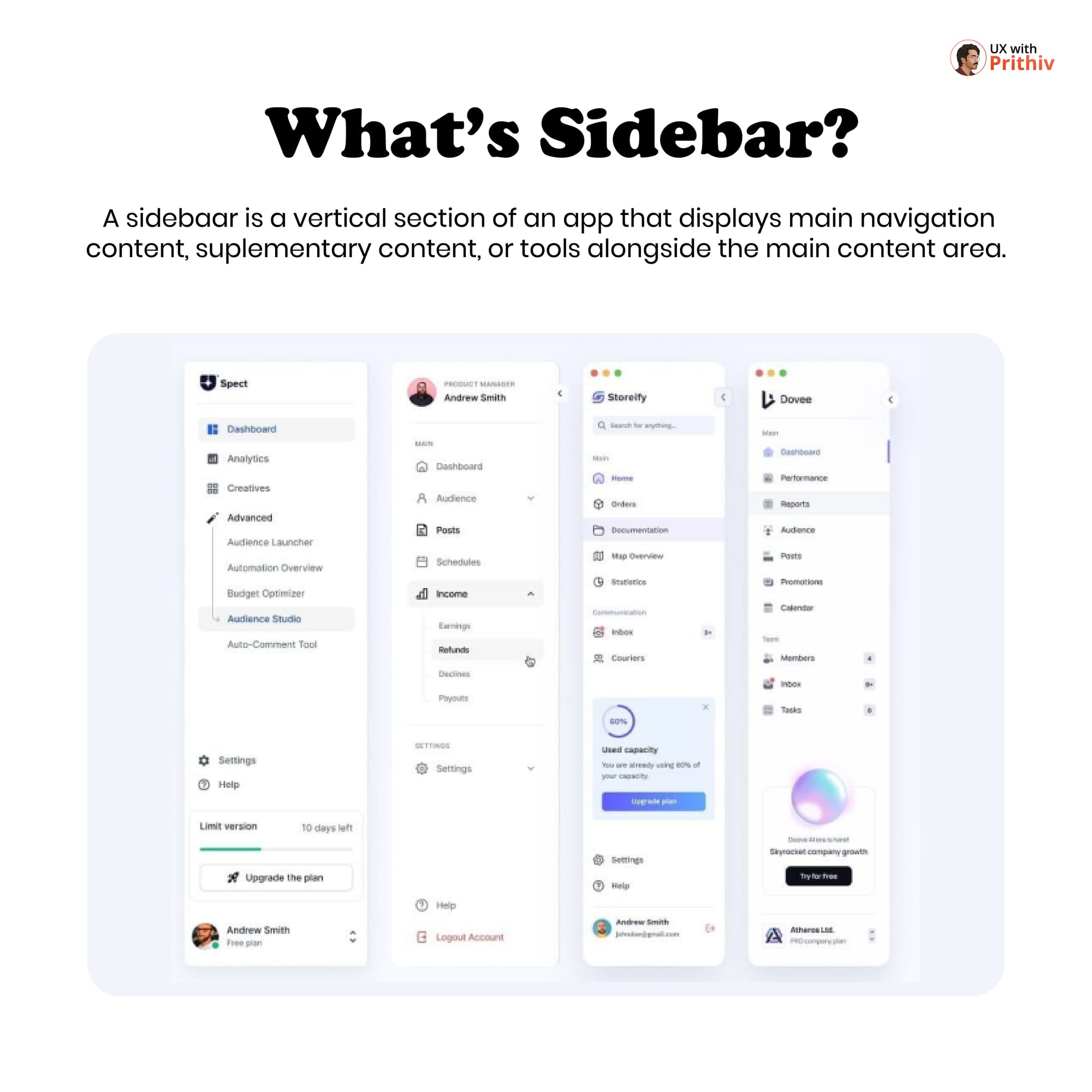
The sidebar is arguably the most crucial component in any desktop or large-screen web application. It acts as the anchor of the interface, displaying main navigation and providing quick access to supplementary content and tools. A well-designed sidebar ensures clarity, hierarchy, and efficiency.
Here is an analysis of the key elements and rules for designing a superior sidebar:
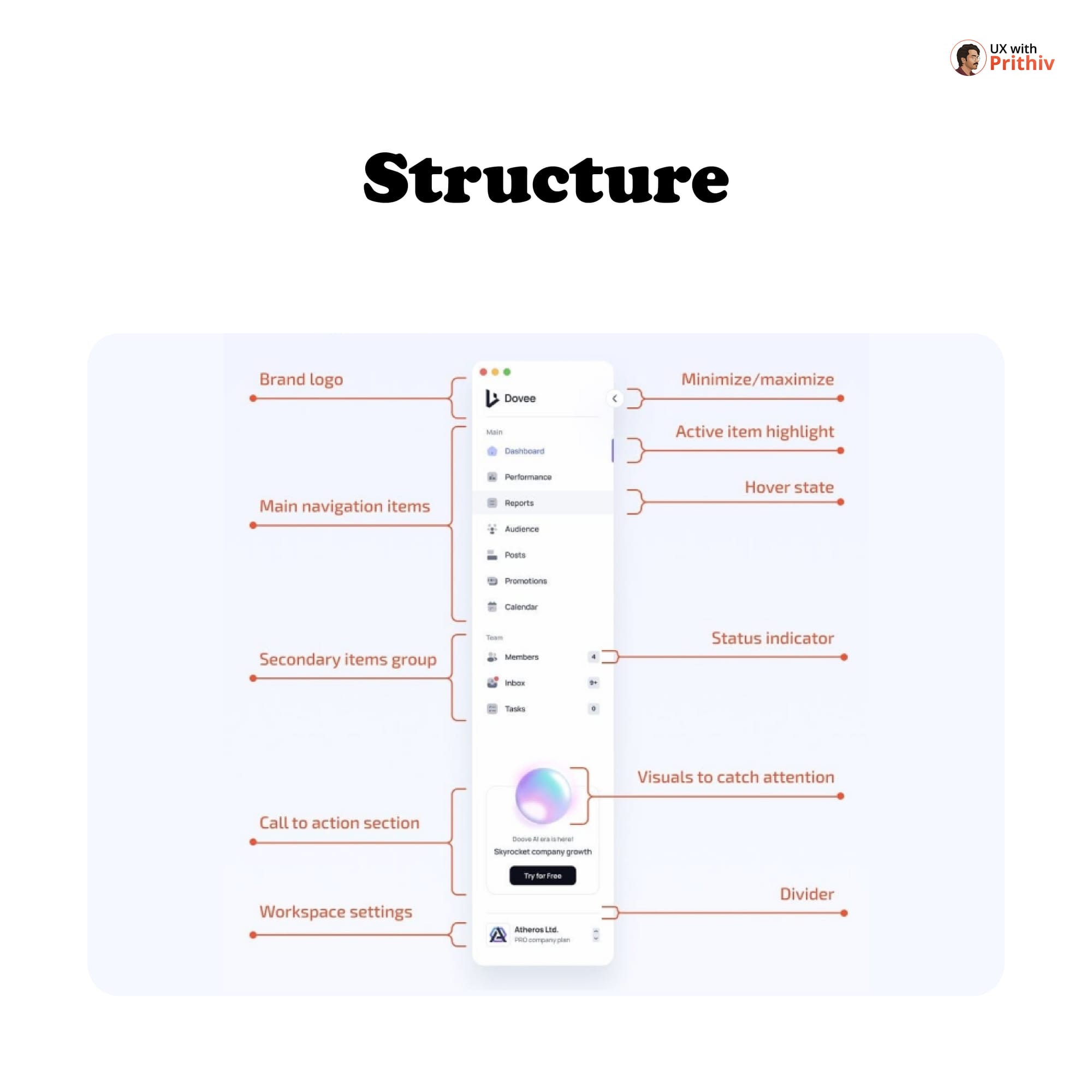
1. The Essential Structure (The 5 Main Sections)
An effective sidebar is organized into distinct, predictable sections, as demonstrated in the "Spect Dashboard" example:
- Top (Branding & Control):
- Brand Logo: Clearly identifies the product.
- Minimize/Maximize: A control to collapse or expand the sidebar for focused work.
- Main Navigation: The primary list of core app functions (e.g., Dashboard, Performance, Reports).
- Use a clear Active Item Highlight and Hover State to indicate location and interactivity.
- Status Indicators can be used next to items (e.g., a badge count for new messages in "Inbox").
- Secondary Items Group: Items that are less frequently used but still important (e.g., Members, Inbox).
- Call to Action (CTA) Section: A highly visible area for business goals (e.g., "Skyrocket company growth," "Try for Free," "Upgrade the plan").
- Bottom (User & Help):
- Workspace Settings/User Profile: Allows the user to manage their account or switch workspaces.
- Help & Settings: Links for support and general application configuration (e.g., Help, Settings, Logout).
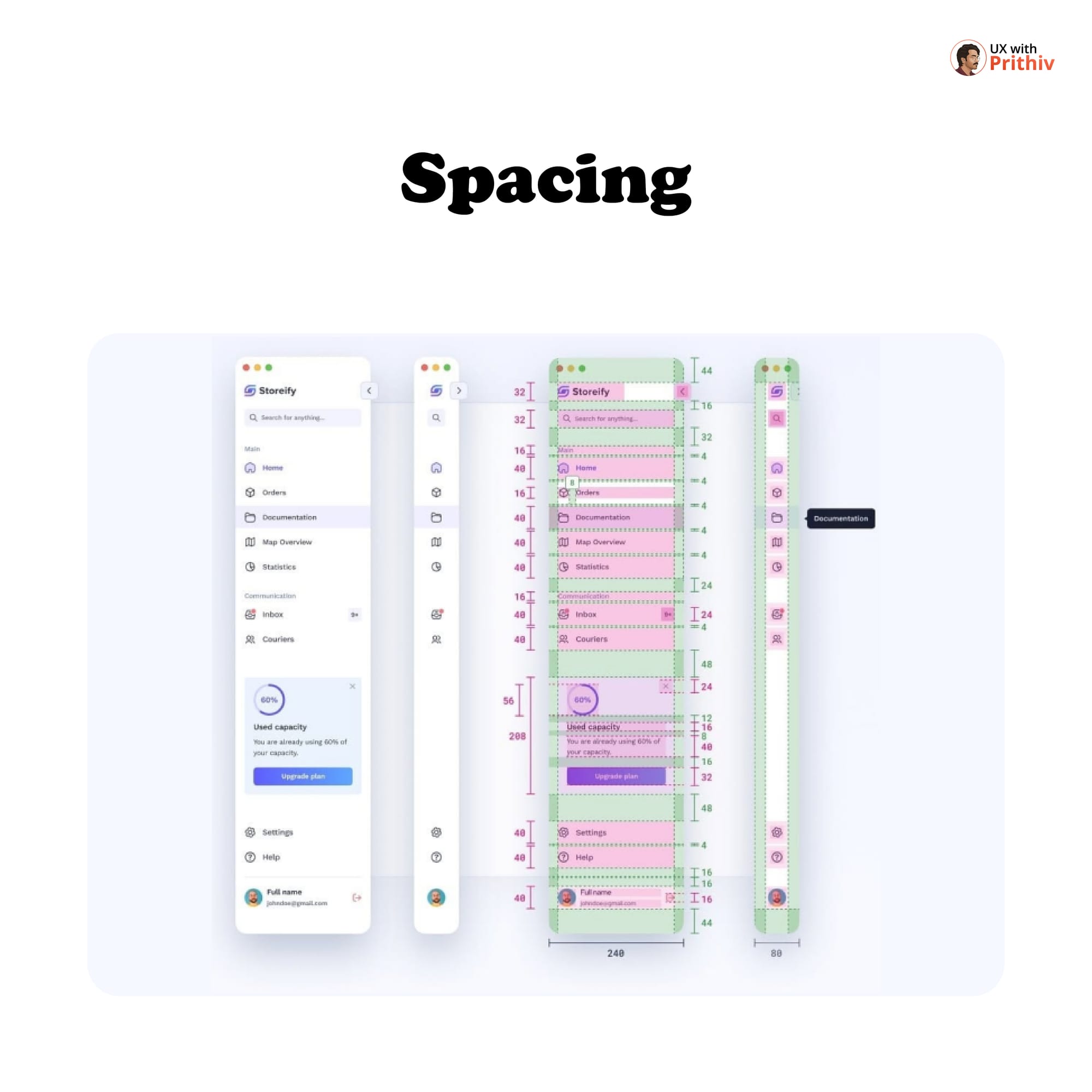
2. Spacing for Visual Hierarchy
Consistent spacing is vital for communicating hierarchy and avoiding visual clutter.
- Group Separation: Use larger vertical spacing (e.g., 32px or more) between major sections (like the logo and main navigation).
- Navigation Item Spacing: Ensure generous vertical padding for clickability and scanning (e.g., 40px height for main links).
- Side Padding: Maintain consistent horizontal padding (e.g., 16px to 24px) on both sides of the content.
3. Handling Secondary Navigation
For complex applications, some primary items may hide a secondary level of navigation. These inner pages are usually expandable under the parent item, helping to declutter the main view while keeping advanced features accessible.


Comments