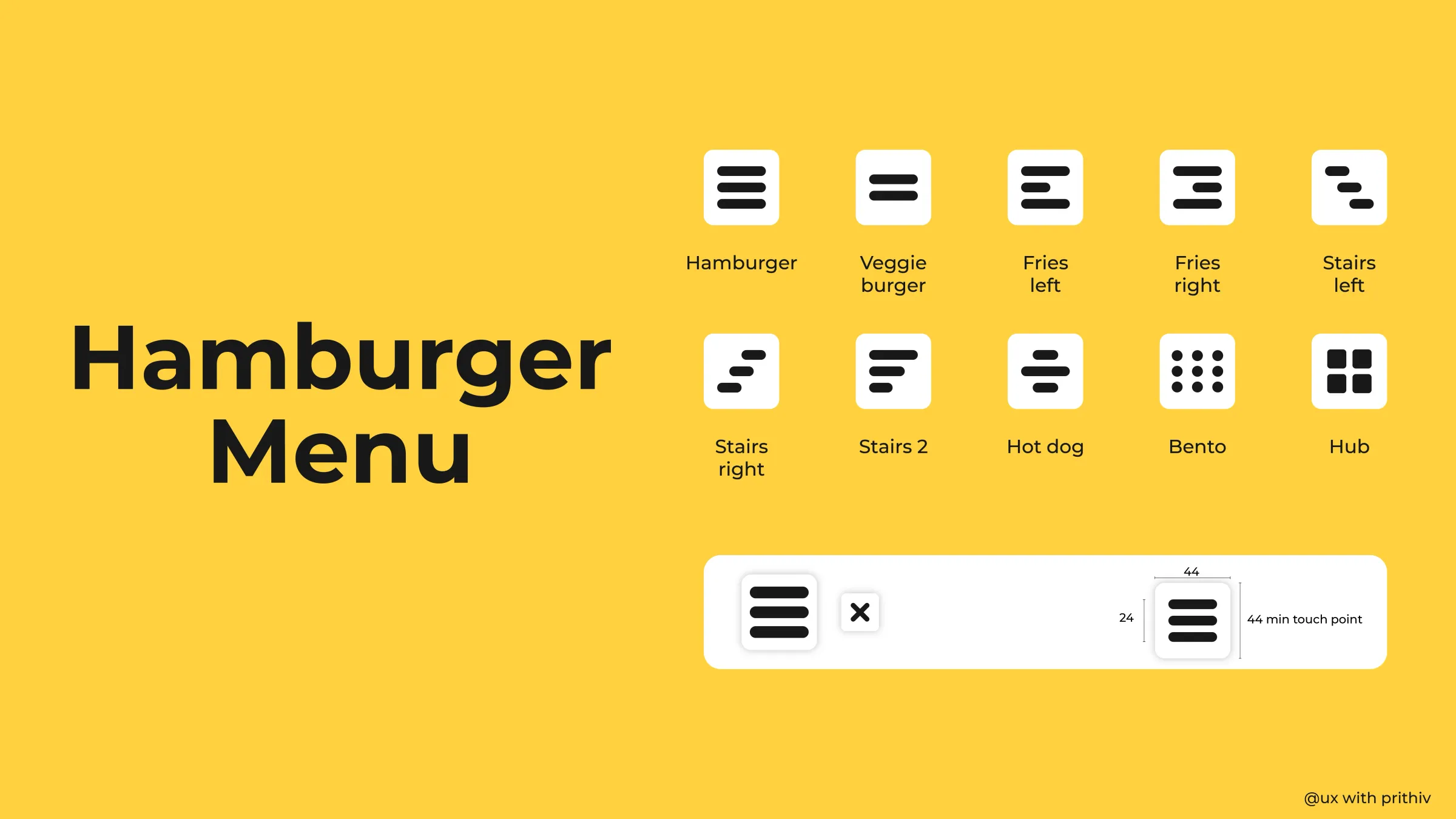
The Hamburger menu's primary advantage is its ability to reduce visual clutter, adhering to the principle of "Less is More." However, its main drawback—hiding crucial functionality—demands strict guidelines for its use.
1. The Strategy: When to Use It
The primary rule of the Hamburger Menu is that it should never hide primary navigation or core functionality.
- Use Case: Reserve the Hamburger menu for secondary and tertiary links. This includes less frequently accessed items like settings, support, legal pages, or profile history.
- The Tab Bar Rule: If a link is necessary for 80% of a user's tasks (e.g., Home, Search, Profile), it belongs on a persistent, dedicated navigation element like a Tab Bar (mobile) or Global Navigation (desktop).
- The Mobile Context: On mobile devices, where screen space is severely limited, the Hamburger is often the most efficient way to maintain a clean aesthetic while keeping an extensive site map accessible.
2. Accessibility: The Critical Touch Target
A button is useless if the user can't tap it reliably. A foundational best practice in mobile UI design is ensuring all interactive elements meet a minimum size for touch-based interaction.
- The 44px Mandate: The touch target for the Hamburger icon (and all mobile interactive elements) MUST be at least 44 pixels by 44 pixels. This dimension is mandated by accessibility guidelines (WCAG) to accommodate the average human fingertip and prevent tap errors.
- The Visual Size vs. Target Size: The icon itself (the three lines) may be smaller (e.g., 24px), but the invisible padding around it, which registers the touch event, must extend to the full 44px minimum.
3. Alternative Naming and Icons
One common flaw of the three-line icon is its low discoverability, especially for non-tech-savvy users.
- Labeling: Where possible, augment the icon with a text label like "Menu" or "More." This dramatically increases its recognition and click-through rate, particularly on web platforms.
- Icon Evolution: While the three lines are universally recognized now, context-specific icons like the nine-dot grid (Hub or App Launcher) can be used to indicate a list of applications or tools within an ecosystem, often making the function clearer than the classic three lines.
Conclusion
The Hamburger Menu remains a powerful, high-density navigational tool for mobile design. But its effectiveness is entirely dependent on context and execution. Follow the rule: hide less important items and ensure its touch target is always a generous 44px minimum. By doing so, you maintain a clean design without frustrating your users.


Comments