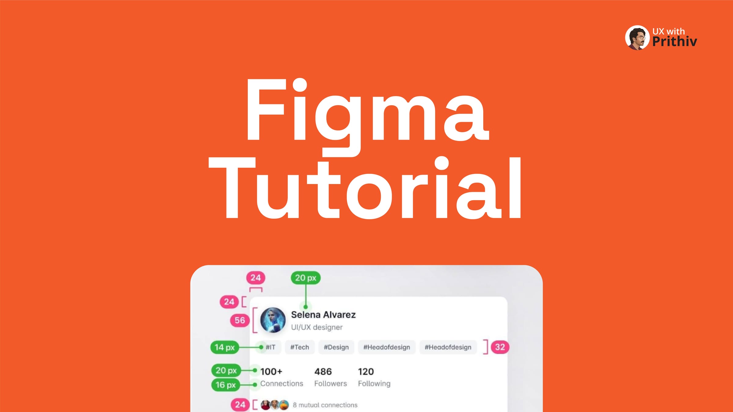
Figma's Auto Layout is arguably the most powerful feature for building scalable, responsive, and professional UI components. It transforms static designs into dynamic systems that are essential for any design system or high-fidelity prototype.
This guide breaks down the process of building a complex UI card—specifically a LinkedIn Profile Card—by combining simple elements into nested Auto Layout frames, following the methodology outlined in the attached tutorial.
Step 1: Start with the Core Text and Avatar (The Top Section)
The foundation of any component begins with its smallest, most critical parts: content and hierarchy.
- Text and Title: Create two text layers (e.g., Name: 20px, Semibold; Title: 16px, Regular).
- Initial Auto Layout: Place these two text layers into an Auto Layout frame (
Shift+A) to manage their vertical spacing (e.g., 4px spacing). - Add Avatar: Add your avatar component. Place the new text frame and the avatar component together into a new Auto Layout frame. This forms the primary "Top" section of the card, with horizontal alignment and appropriate spacing (e.g., 12px spacing).
Step 2: Create a Dynamic Tag/Badge Section
Tags and badges need to be flexible enough to handle varying text lengths without manual resizing.
- Badge Component: If not already available, create a simple badge component (Text layer + Auto Layout frame with horizontal padding).
- Group Badges: Select multiple badge components and combine them into a single horizontal Auto Layout frame (
Shift+A). This frame (labeled "Tags") allows you to easily add or remove tags, and the container will automatically adjust.
Step 3: Build the Engagement/Stats Section
For information like connections, followers, and mutual contacts, a clear structure is necessary.
- Stats Structure: Create a three-column layout for the core statistics (Followers, Following, Connections). Ensure each stat (number + label) is clearly defined.
- Mutual Connections: Create the "Avatar Group" (Avatars + Text layer, with negative spacing on the avatars for overlap). Group this with the CTA buttons in a separate Auto Layout frame.
Step 4: Combine Components into the Final Card
The final step is nesting all the previous Auto Layout frames into the ultimate card component.
- Combine the "Top" section and the "Tags" section into a vertical Auto Layout frame.
- Combine the "Stats" and the "Buttons+Connections" into a vertical Auto Layout frame.
- Combine these two major sections into the "Linker Card" frame.
- Card Properties: Apply generous padding (e.g., 24px horizontal and vertical padding) to the final card frame. The inner elements should be set to Fill Container to ensure the card is perfectly responsive and resizes smoothly.
By building this way, you create a complex card that can be instantly resized, have its content swapped, and maintain perfect spacing—all thanks to the nested power of Auto Layout.


Comments