In the world of visual storytelling, color is one of the most powerful, and often subconscious, tools for communicating meaning and guiding audience expectation. Disney, in particular, has mastered the use of color to establish moral alignment.
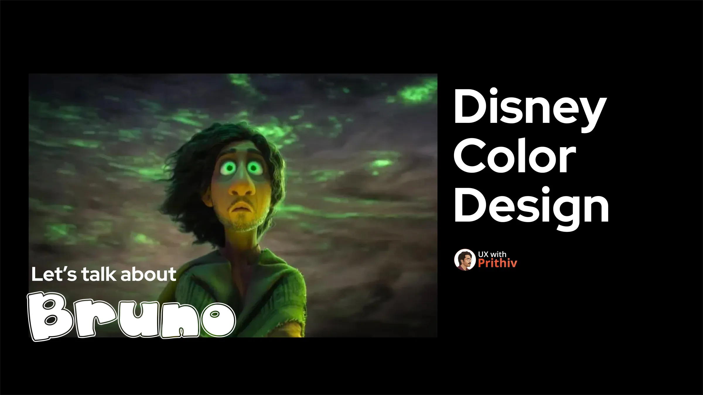
"Disney Color Design," highlights a key historical pattern and a brilliant, modern subversion of it, specifically within the movie Encanto.
The Historical Rule: Green = Evil
For decades, the color green has been strategically used in Disney animation to signify danger, mystery, and villainy.
- This traditional use of a lime color is a form of visual UX, training the audience's brain to associate that hue with the character they should "root against".
- It's a powerful shortcut, much like a dark pattern in UI, that establishes immediate context without needing dialogue.
The Encanto Subversion: Bruno and the Green Cloak
This brings us to Bruno from Encanto, a character shrouded in mystery.
- The Trap: Bruno wears green, making him look like a traditional Disney villain. The creators relied on the audience's deep-seated association with the color, knowing that "return viewers to assume the color green would be used for evil here". This clever manipulation builds tension and initial distrust.
- The Subtlety: The true masterstroke, however, is the subtle use of green on the protagonist, Mirabel. Her glasses are green.
- The New Meaning: In this context, the green shifts its meaning from "evil" to symbolizing "seeing the truth". This small detail reframes the entire narrative, telling the audience, subconsciously, that the character wearing the color is associated with the film's core theme of finding the truth, rather than acting as a villain.
The UX Takeaway for Designers
Disney's color strategy offers a vital lesson for product and UX designers:
- Understand User Expectations: Know the existing mental models your users bring to your design (e.g., green for success, red for error).
- Use Subtlety to Guide: Color doesn't always have to be bold and obvious. Subtly reinforcing a new meaning or intention (like Mirabel's glasses) can powerfully shift perception and communication.
- Color Makes the Design Work: The strategic use of color is just another way it can really make a design work.


Comments