Wait time is one of the biggest friction points in any digital experience. As designers, we can’t always make the backend faster, but we can certainly make the wait feel shorter through intentional UX.
Choosing the right loading indicator isn't a visual preference—it’s a strategic decision that manages user anxiety and sets expectations. Here is a breakdown of the most common states and when to use them:
The Loading Toolkit
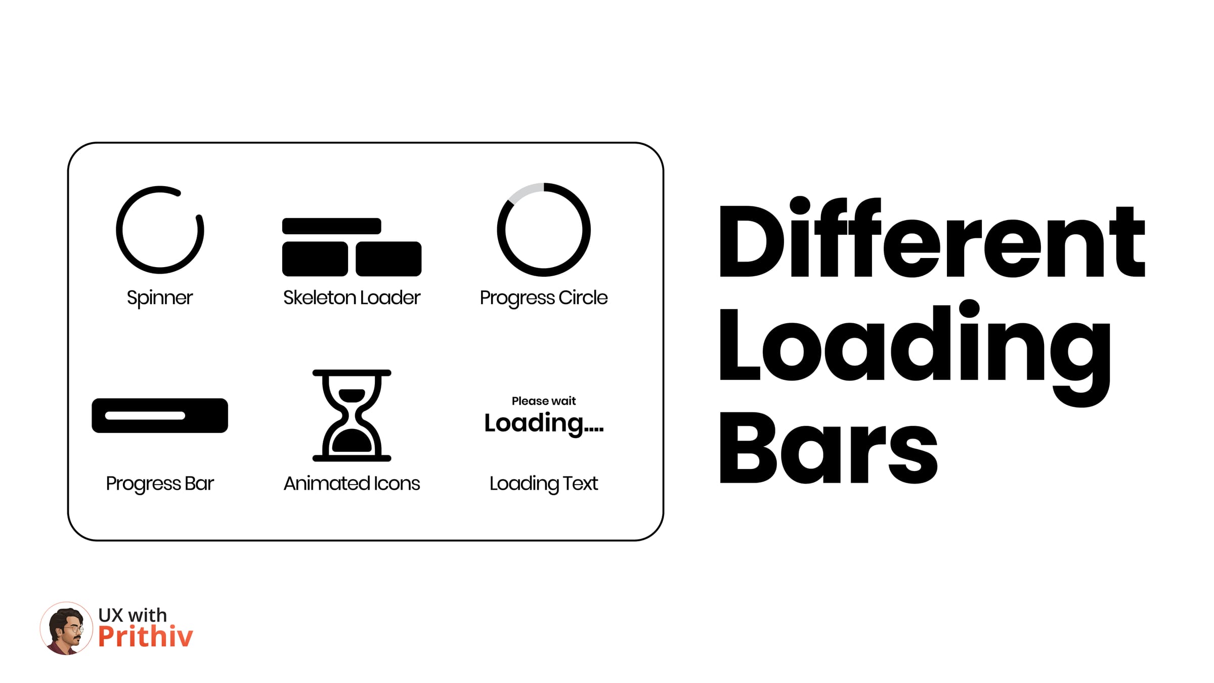
- Skeleton Loaders: These are the gold standard for perceived performance. By showing the layout structure before the content arrives, they make the app feel like it is already loading data.
- Progress Bars & Circles: Use these for deterministic waits. If a user knows exactly how much longer a task will take, they are far more likely to stay patient.
- Spinners: Best for short, indeterminate background tasks (under 2 seconds). For anything longer, a spinner can actually increase user anxiety as it provides no feedback on progress.
- Animated Icons & Loading Text: These add a layer of brand personality. A clever animation or a bit of "Loading..." text can humanize a sterile wait time.
The Senior Perspective
Great UX is about visibility of system status. Never leave your user in a "Silent Interface". Every second of wait time needs a response—a loader, a toast, or a success state—to build professional trust.


Comments