


In the world of UI/UX, true mastery comes not just from knowing what to do, but knowing what not to do. Every designer must confront a set of common traps—the "deadly sins"—that sabotage usability, destroy trust, and ultimately doom a product.
Avoiding these seven sins is essential for moving from an average designer to a strategic problem-solver.
The Seven Deadly Sins and How to Confess:
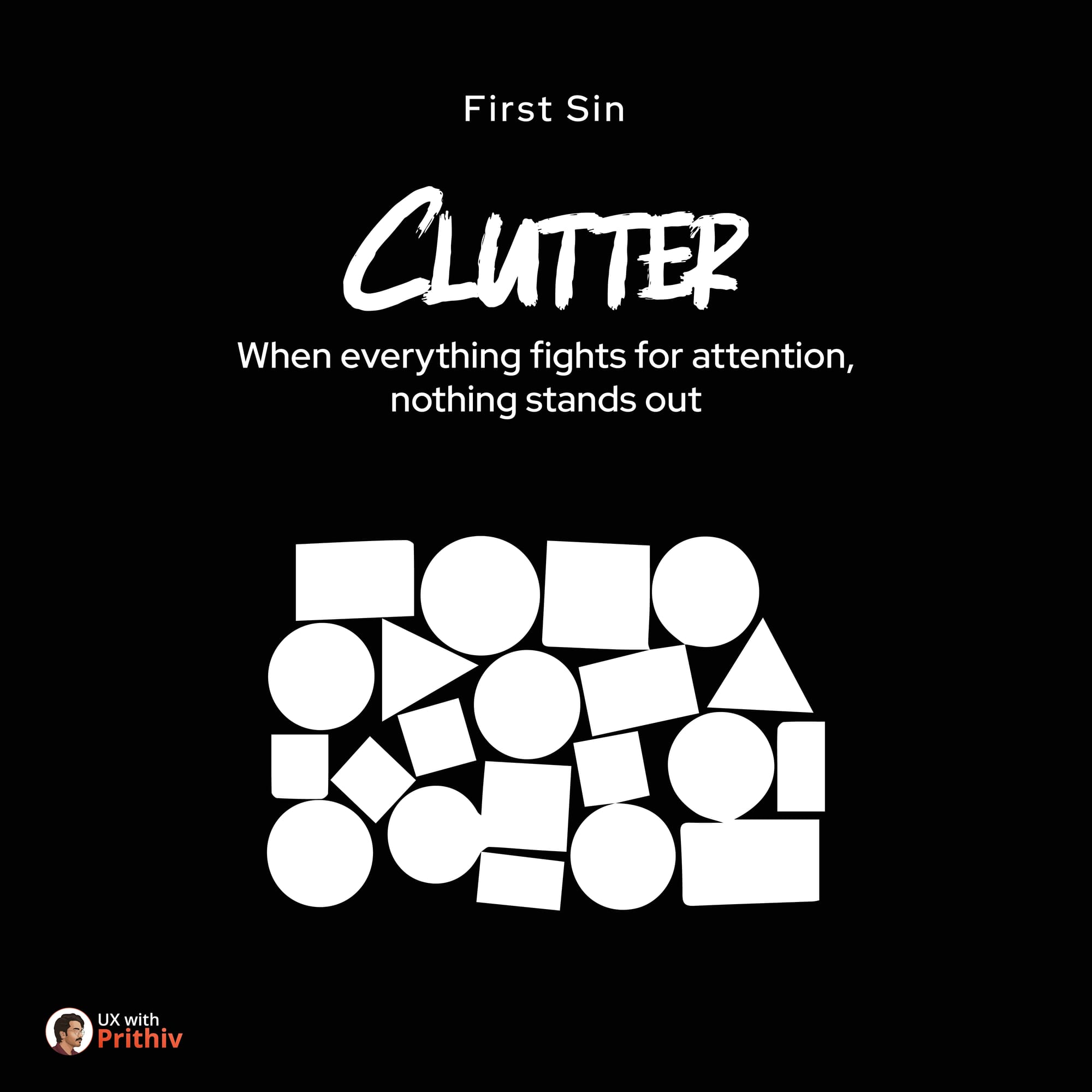
1. CLUTTER (The Sin of Excess)
- The Error: When everything fights for attention, nothing stands out. Overwhelming the user with too many elements, notifications, or options.
- The Fix: Embrace whitespace. Prioritize content ruthlessly. If an element doesn't serve a clear purpose, remove it.
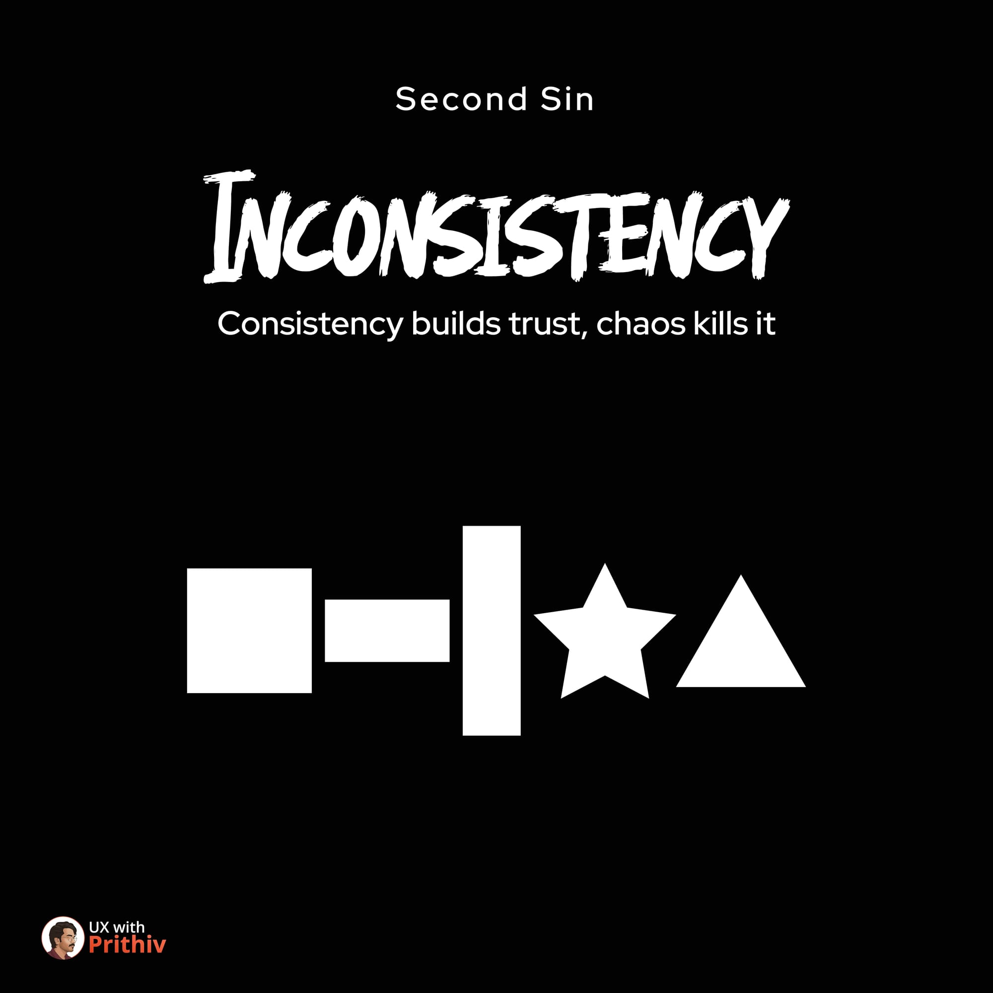
2. INCONSISTENCY (The Sin of Chaos)
- The Error: Using varying button styles, different color palettes for the same element, or unpredictable layouts. Consistency builds trust; chaos kills it.
- The Fix: Invest in a Design System. Define clear rules for components, typography, and spacing. Use your system religiously.
3. OVERCOMPLICATION (The Sin of Ego)
- The Error: Adding features or steps just because you could, not because you should. It's the impulse to over-engineer simple solutions.
- The Fix: Refine, don't just add. Always seek the simplest path to achieve the user's goal. Simplify flows and hide advanced options until they are needed.

4. IGNORING CONTEXT (The Sin of Isolation)
- The Error: Designing for screens, not for people. Failing to consider the user's environment, state of mind, device, or time of use.
- The Fix: Use Empathy Maps and User Journey Maps. Design for real-world scenarios, acknowledging constraints like weak internet or noisy environments.

5. COPY NEGLECT (The Sin of Silence)
- The Error: Having a beautiful interface with empty words, which ignores clarity. Poor microcopy leads to confusion and error.
- The Fix: Treat UX writing as seriously as visual design. Ensure every label, button, and error message is clear, concise, and human.

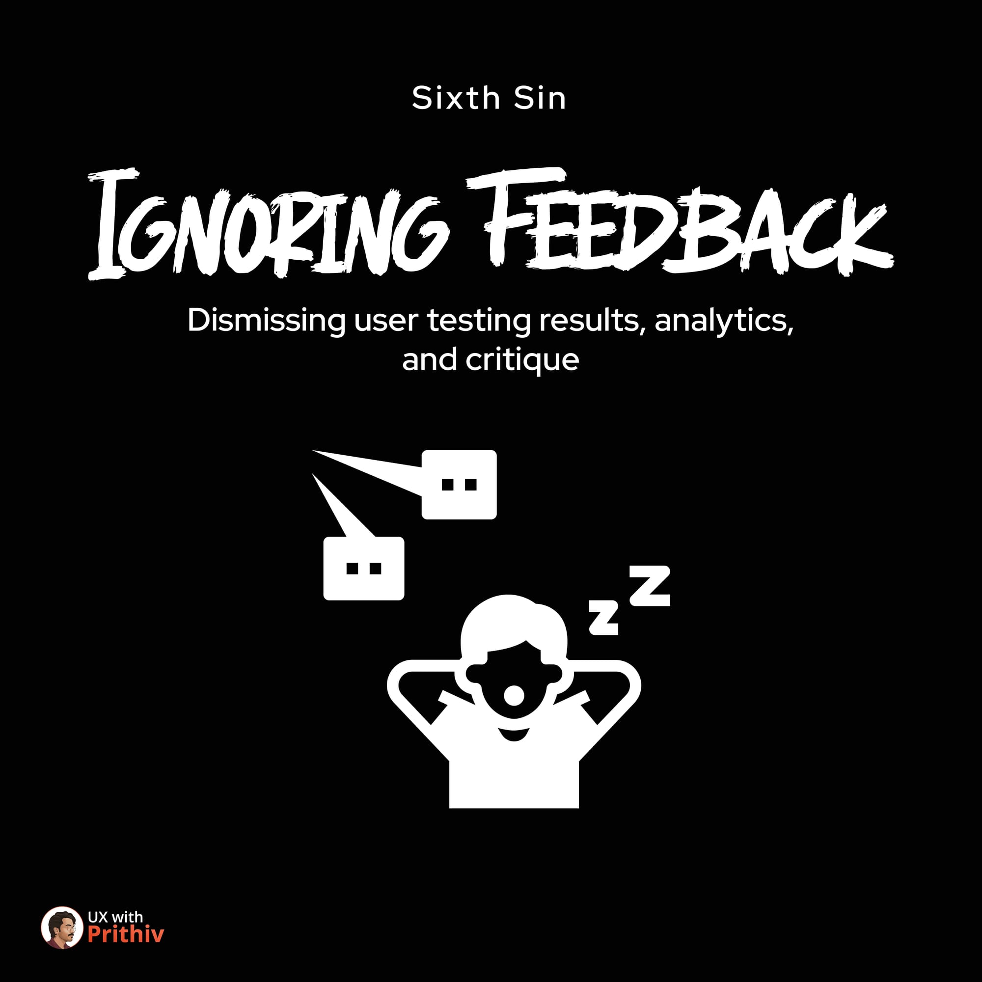
6. IGNORING FEEDBACK (The Sin of Arrogance)
- The Error: Dismissing user testing results, analytics, and critique. Believing your intuition outweighs objective data.
- The Fix: Close the loop. Integrate user research into the entire lifecycle. View negative feedback not as an attack, but as free guidance on where to improve.
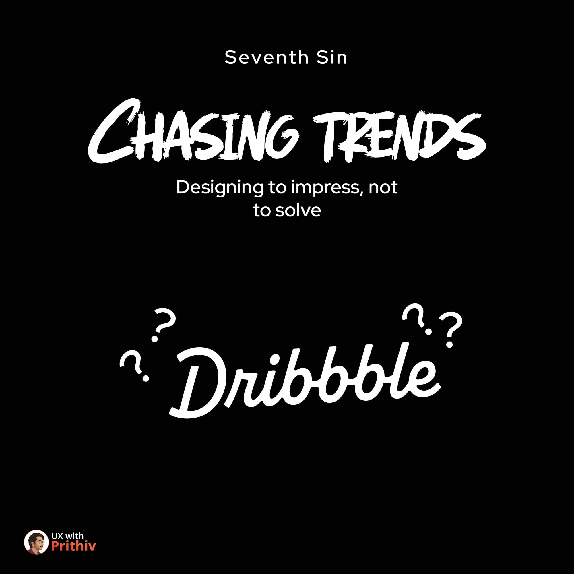
7. CHASING TRENDS (The Sin of Vanity)
- The Error: Designing to impress (e.g., for Dribbble), not to solve. Prioritizing fleeting visual trends over long-term usability.
- The Fix: Focus on core user needs. Remember: good design is invisible. If a trend conflicts with usability or accessibility, drop it immediately.


Comments