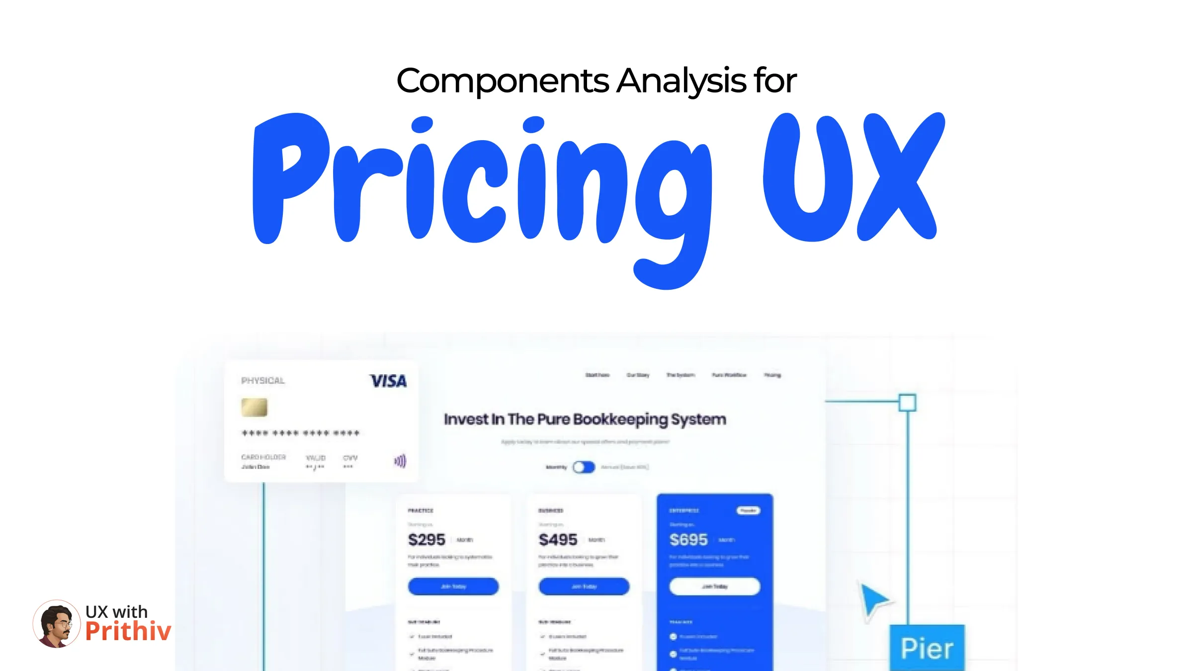
The pricing page is the critical bridge between product value and business revenue. A poor layout can cause confusion and abandonment, while smart component analysis can clarify value and boost conversions.
Top designers don't just list prices; they use specific component structures to guide the user's decision-making process. Here is an analysis of five essential pricing components and their strategic UX purpose.
1. Payment Cards: For Instant Clarity
The simplest and most scannable structure, ideal for straightforward product offerings.
- Goal: To make the pricing immediately clear and scannable.
- UX Benefit: Users decide faster when the value proposition (price, key features) is easy to spot. This format reduces cognitive load by eliminating clutter, allowing users to quickly assess if the product is in their budget.
2. Compressed Cards: For Lightweight Comparison
When you have multiple tiers but need to conserve vertical space or maintain a minimal aesthetic.
- Goal: Stack information without clutter.
- UX Benefit: Uses compact cards to present multiple plans in a lightweight, easy-to-read layout. This keeps the page short and focused while still providing necessary details, ideal for initial marketing pages.
3. Column Components: For Direct Comparison
This is the standard, high-leverage component for competitive comparison.
- Goal: Let users compare features and spot differences at a glance.
- UX Benefit: Side-by-side columns make it effortless to compare feature lists and choose the right plan. A clear hierarchy and consistent layout are key to helping users understand value and upgrade confidently.
4. Pricing Comparisons (The Underlying Structure)
Regardless of the physical component used, the structure itself drives the decision.
- Goal: Establish clear hierarchy (e.g., highlighting a "Most Popular" or "Recommended" tier).
- UX Benefit: This ensures that the user's attention is strategically drawn to the plan that provides the best value for them and the highest conversion for the business. The layout should guide the eye from the lowest commitment to the highest value proposition.
5. Hybrid Card: For Depth and Simplicity
A modern approach that balances summary with detail.
- Goal: Blend quick-glance clarity (price/name) with a detailed feature list (e.g., collapsed feature sections).
- UX Benefit: It's perfect when you need to offer both depth and simplicity in one view. Users who are quickly scanning can get the gist, while detailed users can expand the feature list without leaving the primary card.
Designing a pricing page is about applied psychology and visual hierarchy. By strategically deploying these components, designers can turn a point of financial friction into a smooth conversion moment.


Comments