


Color is arguably the most powerful tool in a designer's arsenal. It doesn't just make an interface look good; it instantly communicates brand emotion, visual hierarchy, and user intent. Choosing the right palette is often the difference between a design that feels generic and one that feels premium and intentional.
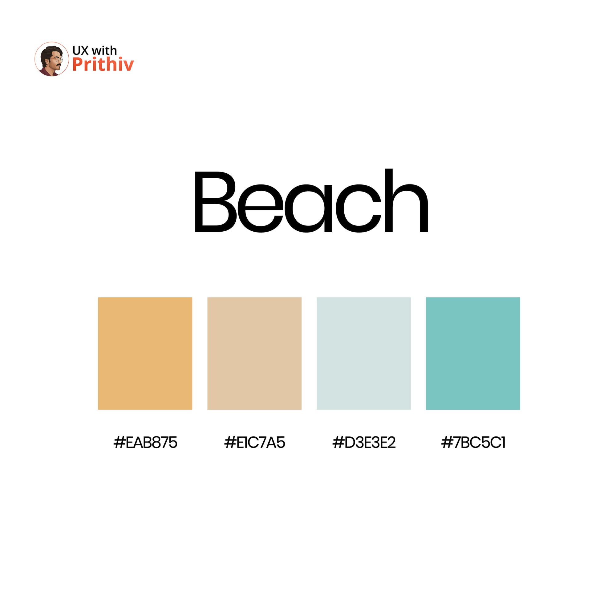
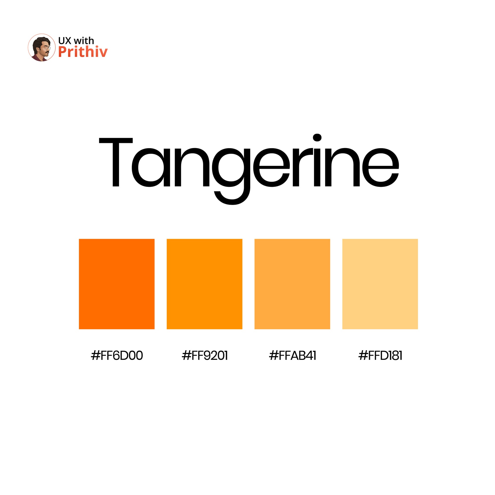
Stop relying on the basic blue and gray defaults. This guide, sourced from the attached resource, presents 8 meticulously curated palettes, each designed to evoke a distinct feeling and context.
The Power of Intentional Color in UX
In UI/UX design, a color palette must do three things:
- Set the Mood: Instantly convey the brand's personality (calm, energetic, trustworthy, playful).
- Establish Hierarchy: Use saturation and darkness to guide the user's eye to primary actions (CTAs) and important information.
- Ensure Accessibility: Maintain sufficient contrast between text and background colors (WCAG standards).
Featured Palettes for Your Next Project
Here are three stunning color palettes from the collection, along with their hex codes and best use cases:
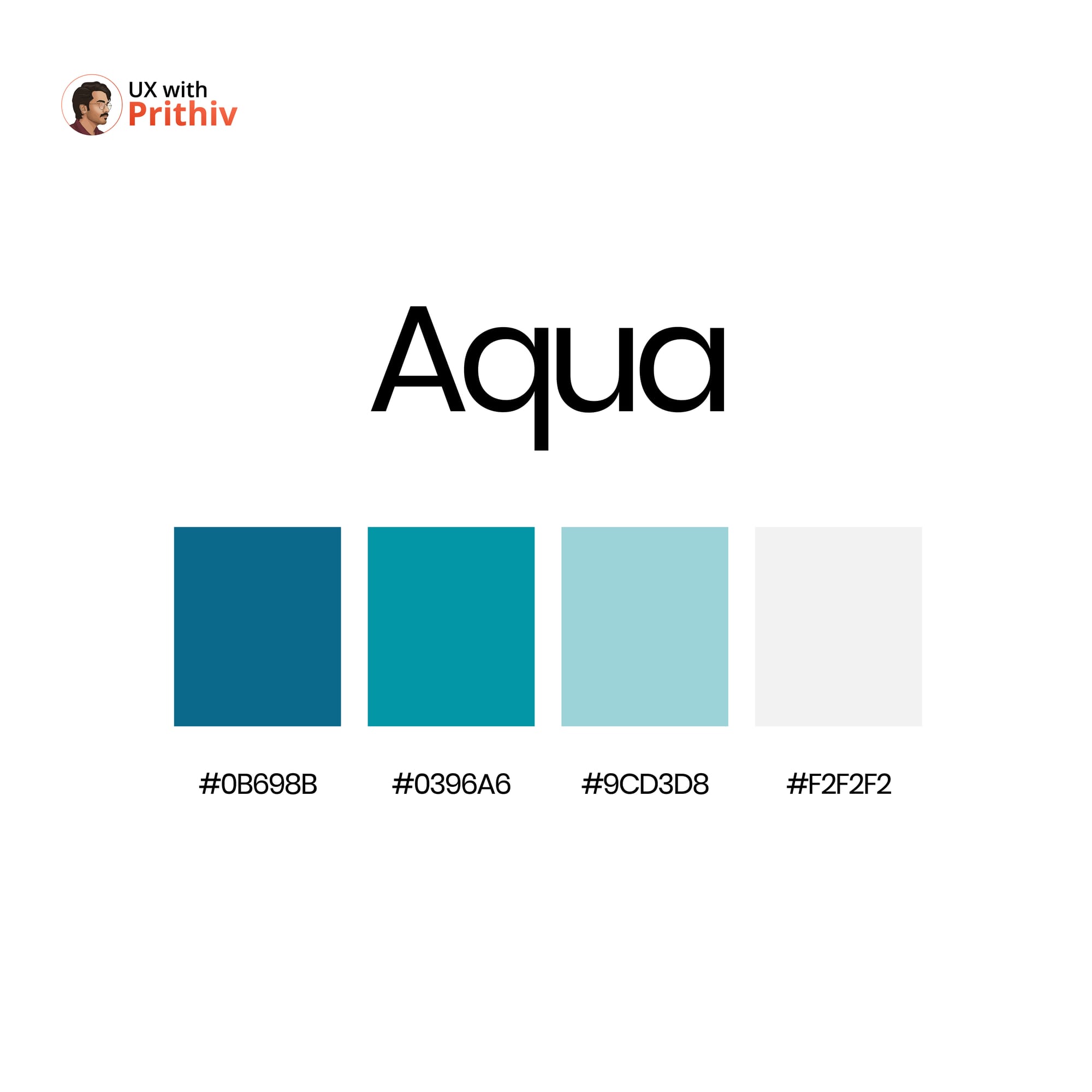
1. Aqua: Professional & Calming 🌊
This palette is ideal for FinTech, wellness, or productivity apps where trust and clarity are paramount. The deep blues anchor the design, while the lighter tones provide airy backgrounds.
- Primary Dark:
#0B698B - Secondary Accent:
#0396A6 - Light Background:
#9CD3D8 - Neutral/Base:
#F2F2F2

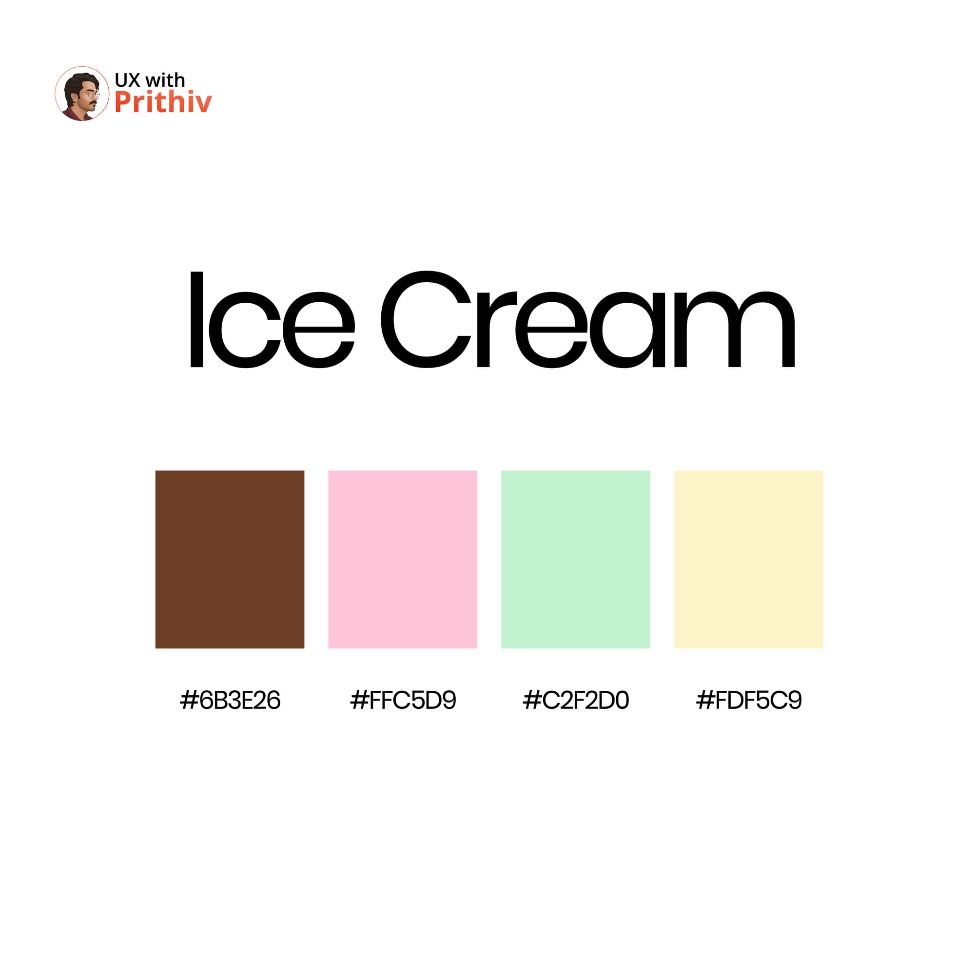
2. Ice Cream: Playful & Light 🍦
Perfect for e-commerce, children's products, or playful consumer apps that require a touch of whimsy. These colors are soft, complementary, and immediately approachable.
- Contrast/Action:
#6B3E26(Great for text or anchors) - Highlight Pink:
#FFC5D9 - Highlight Green:
#C2F2D0 - Soft Base:
#FDF5C9
3. Earth: Organic & Trustworthy 🌳
A grounded, reliable choice for sustainability brands, educational platforms, or luxury goods. The palette balances deep, natural tones with warm, neutral highlights.
- Primary Green:
#4C7972 - Contrast/Warmth:
#915A3C - Neutral Mid-tone:
#CFB79F - Base Gray:
#E8E6E7
By consciously choosing a thematic palette, you move beyond merely coloring the elements on the screen—you begin designing the emotion of the experience.


Comments