


The checkout is the most critical flow in any e-commerce or subscription product. A high drop-off rate here means lost revenue, not poor traffic. The solution isn't just aesthetic; it's psychological and structural. By focusing on removing friction and building trust, designers can unlock significant conversion boosts.
This article details the 5 essential tips plus one bonus strategy to optimize your funnel right now:
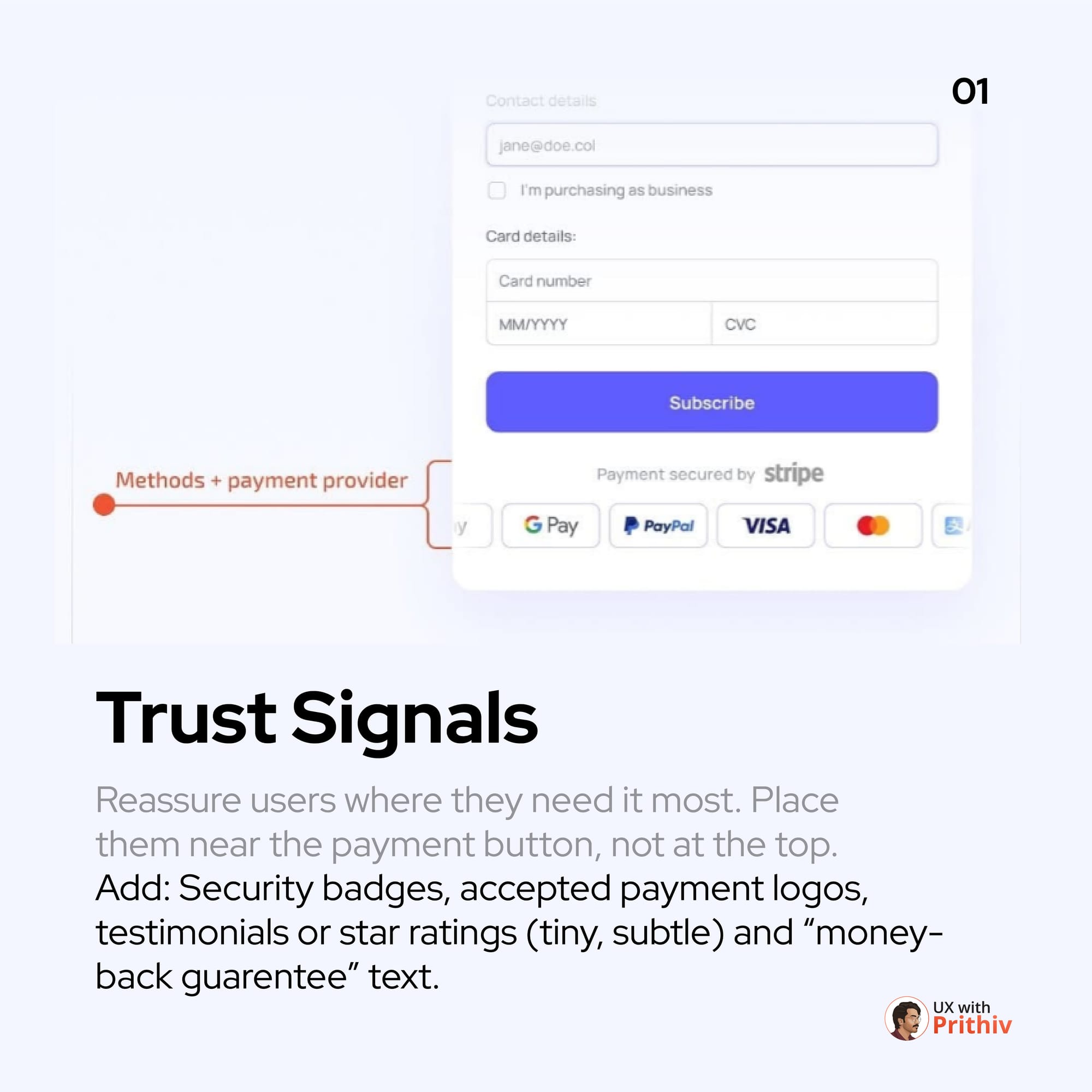
1. Maximise Trust Signals (The Power of Reassurance)
At the payment stage, user anxiety is at its highest.
- Strategy: Place trust signals near the payment button, not just at the top of the page.
- Examples: Security badges (like SSL or payment processor logos), accepted payment provider logos, and subtle star ratings or "Money-back guarantee" text. Reassure the user exactly when they are about to commit financially.
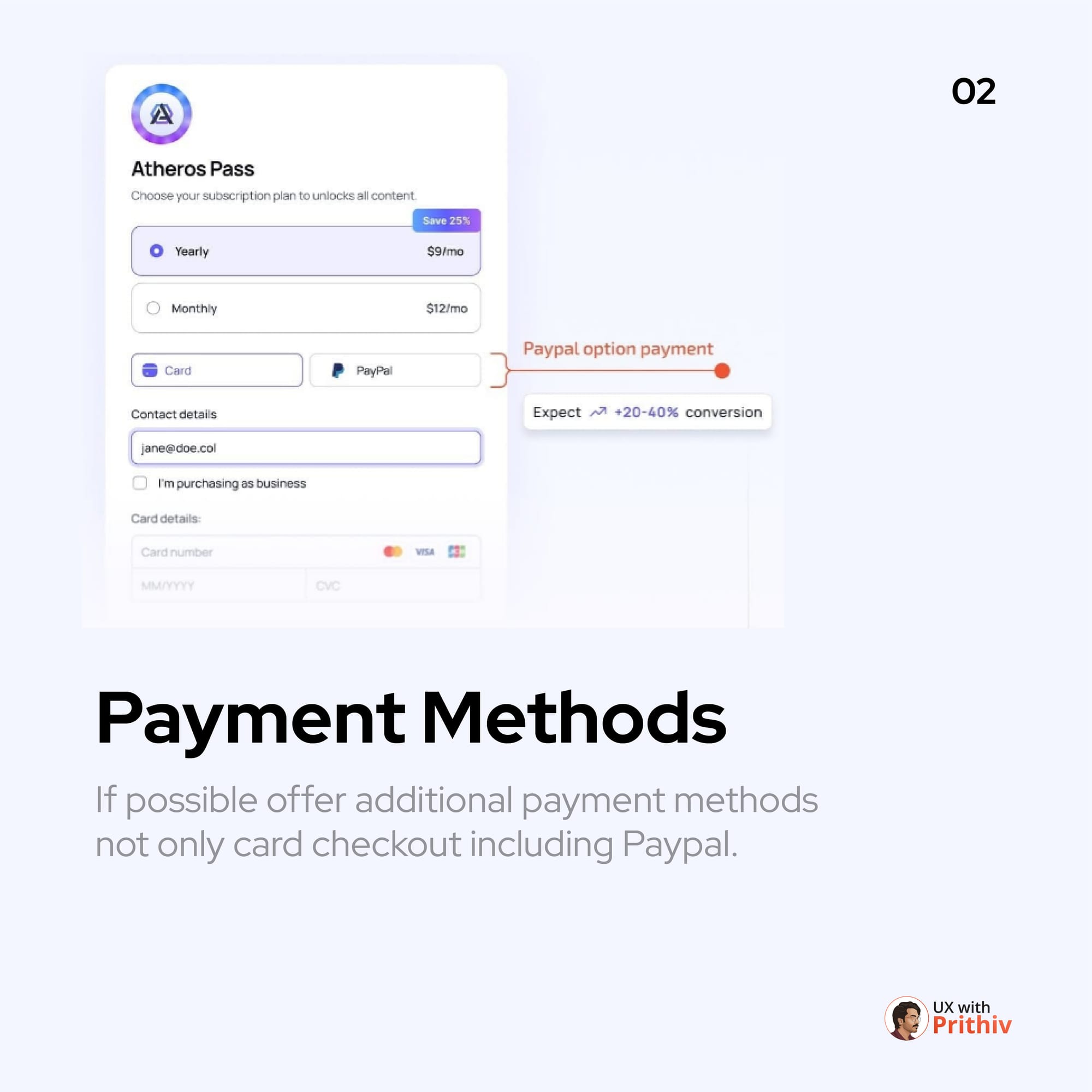
2. Diversify Payment Methods (The PayPal Multiplier)
Limiting payment to only credit cards can alienate a significant user base.
- Strategy: Offer additional payment methods like PayPal, Apple Pay, Google Pay, etc..
- Impact: Offering options like PayPal can lead to a proven 20-40% conversion boost by reducing manual input and leveraging familiar, trusted platforms.
3. Enable Guest Checkout (Reduce Registration Friction)
Forcing first-time users to register before purchasing creates unnecessary friction and delay.
- Strategy: Always allow users to check out as a guest.
- Bonus: You can still prompt for account creation after the purchase is complete, when the customer is happy and the core goal is achieved.

4. Minimize Steps and Show Progress (Reduce Perceived Effort)
Users are less likely to abandon a process if they know exactly how close they are to the finish line.
- Strategy: Consolidate steps where possible and implement a clear, highly visible progress indicator (e.g., "Step 2 of 4").
- Principle: Fewer perceived steps = conversion up.
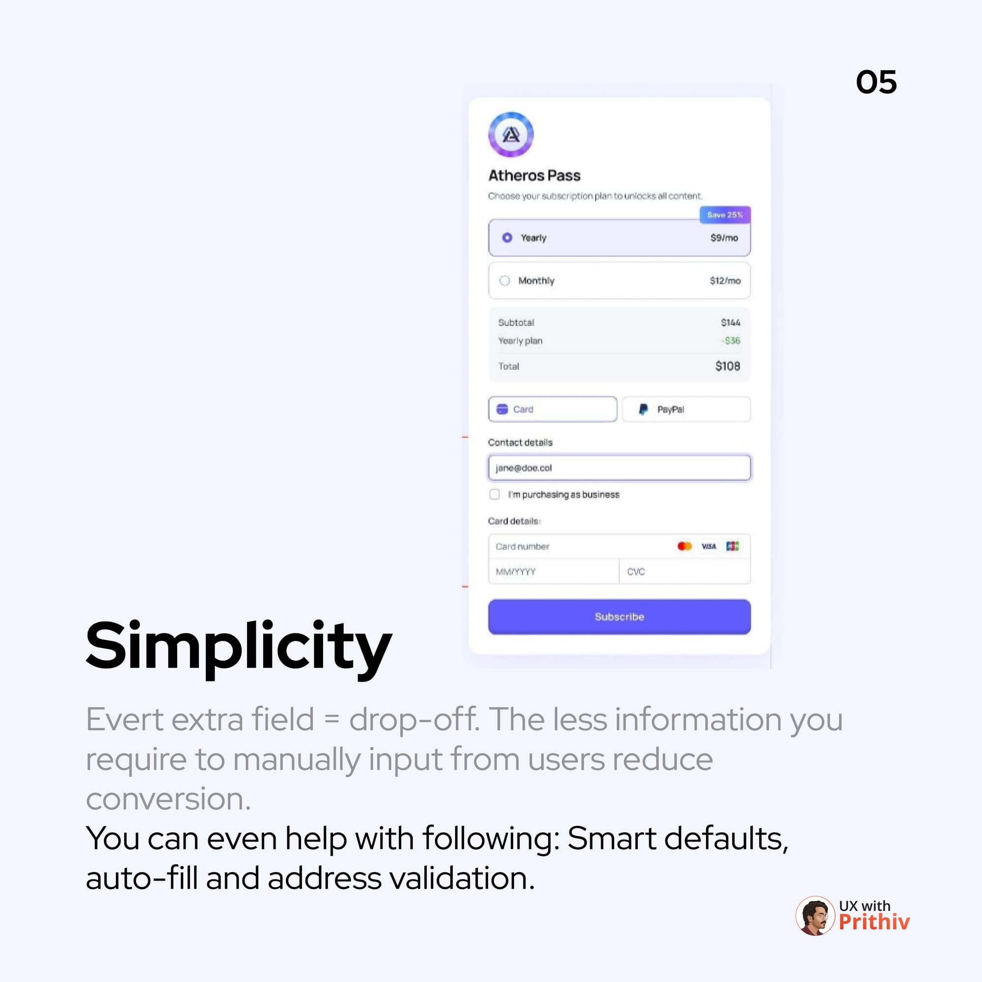
5. Simplify Input Fields (The Power of Auto-fill)
Every extra field a user has to manually fill out increases the drop-off rate.
- Strategy: Strive for simplicity. Utilize features like smart defaults, address validation, and auto-fill for basic information. Only ask for information that is absolutely essential for the transaction.
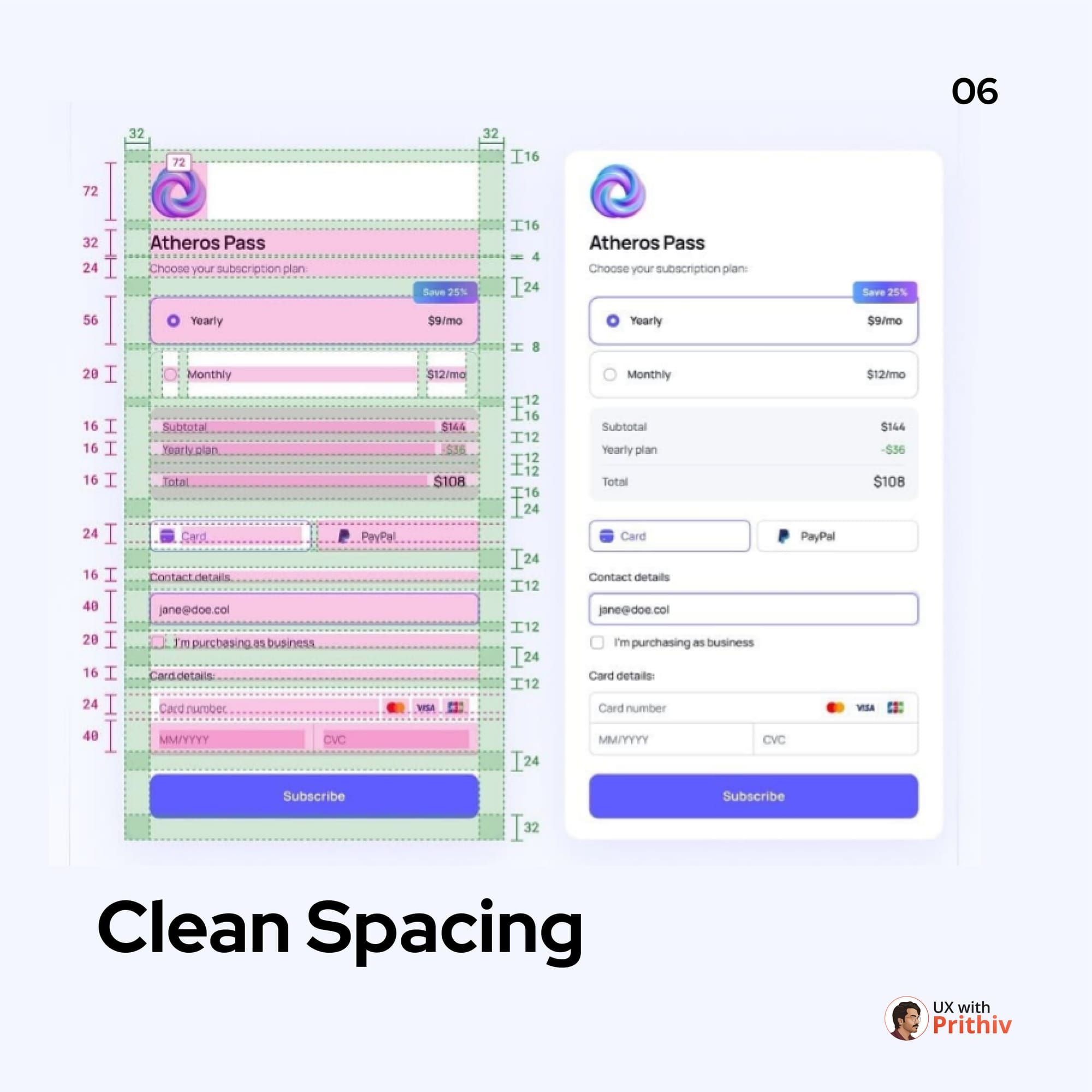
+1. Design for Mobile-First Readability and Spacing
The bonus tip that ties it all together. Ensure your mobile forms use generous and consistent spacing. Large, clear input fields, ample click targets, and clear typography are essential for preventing errors and ensuring the flow feels simple and professional on a small screen.
These principles aren't aesthetic suggestions; they are conversion necessities. Focus on these 5+1 areas, and you will see a measurable difference in your bottom line.


Comments