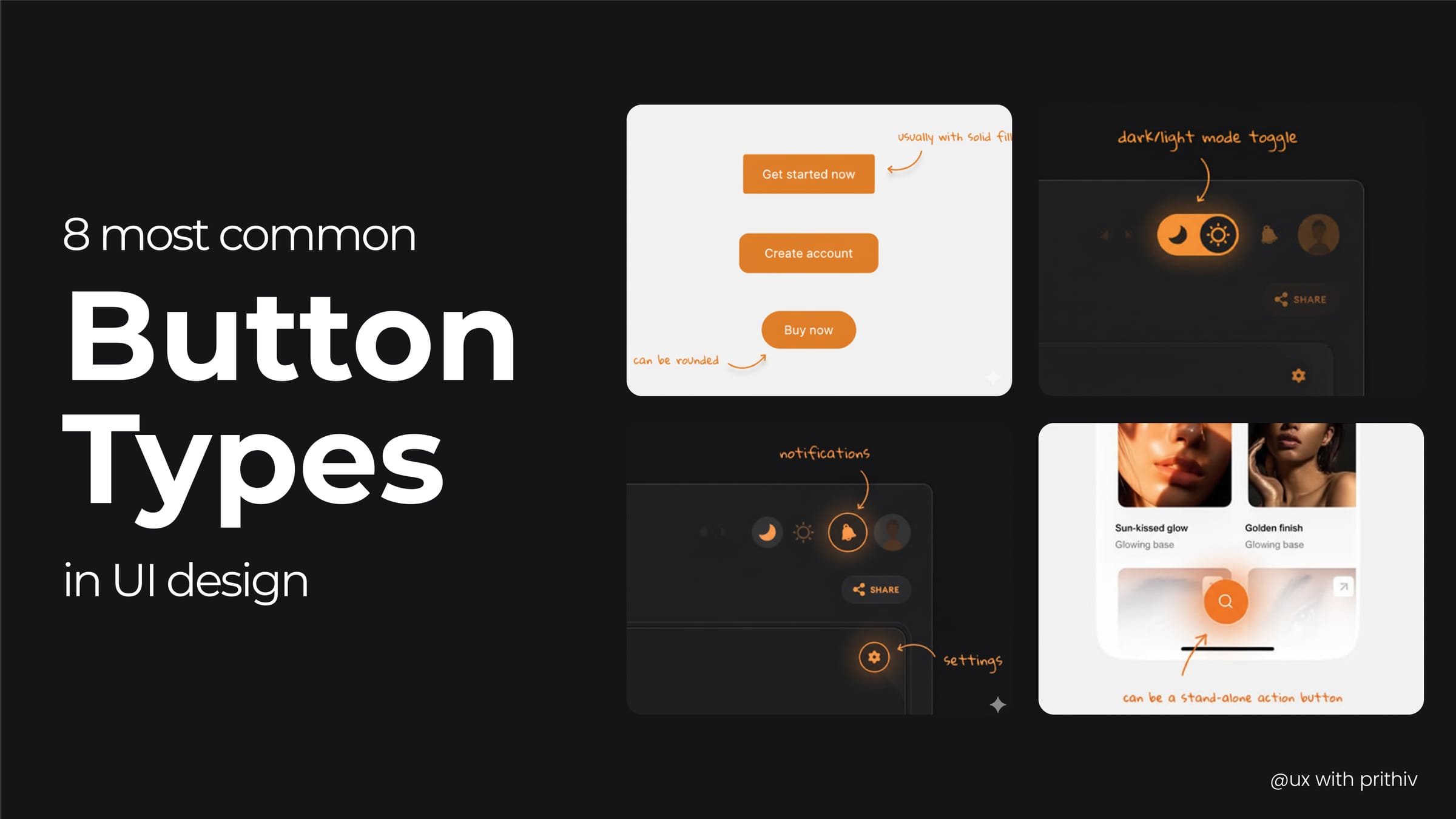
Navigating an interface is all about making decisions, and buttons are the visual cues that guide users through that process. Here are 8 of the most common button types and their ideal applications in UX design.
- Primary Button This is the most prominent button on a page, designed to draw the user's attention to the most important or primary action. It's often filled with a brand's main color and is used for actions like "Submit," "Save," or "Checkout." There should only be one primary button per screen to avoid overwhelming the user.
- Secondary Button Used for a less important action that is still relevant to the user's journey. It typically has a lighter background, an outline, or a different color than the primary button to create a clear visual hierarchy. Examples include "Cancel," "Learn More," or "Add to Cart" when it's not the main action.
- Tertiary Button (Ghost Button) Also known as a "ghost button," this type is used for the least prominent actions. It is often a text-only button without a background or a subtle outline, designed to blend into the background. Use it for low-priority actions like "Clear," "Skip," or "View Details" on a card.
- Floating Action Button (FAB) A circular button that floats above the rest of the UI, typically in a corner of the screen. FABs are used to represent the single most important action on a screen. You'll often see them in mobile apps for actions like creating a new email, a new post, or adding a new contact.
- Toggle Button These buttons are used to change the state of an element or setting. They show a clear "on" and "off" state, often with a visual cue like a change in color, a slider, or an icon. Think of a dark mode toggle or a button that turns on a microphone.
- Icon Button A button that uses an icon instead of text to communicate its purpose. Icon buttons are great for saving space and are often used for common actions that are universally understood, like "Search," "Share," or "Settings." It's important to provide a tooltip or label on hover to ensure clarity.
- Link Button A text link that is styled to look and function like a button. It is a subtle way to present a button-like interaction without the visual weight of a traditional button. They are often used for navigating to a new page or for actions within a sentence.
- Split Button This is a combination of two buttons in one, often used for a primary action and a related secondary action. The main button performs the default action, while a small dropdown arrow next to it reveals a menu of alternative actions. A common example is a "Save" button with a dropdown that includes "Save & Share" or "Save as Draft."


Comments